
What’s 5G and what does it mean for advertising?
Earlier this year, Verizon announced that their next step in the race towards 5G would occur here in Des Moines. Des Moines is the 20th city to receive a 5G mobile network from Verizon, with the wireless carrier aiming to reach 30 cities by the start of 2020.
Verizon joins the rest of the major mobile carriers trying to grow their 5G networks. Even though 5G coverage is expanding on a weekly basis, if you haven’t noticed the monumental shift that the carriers promise, you’re not alone.
5G, in its current state, is more like a beta test than a full-fledged network. It’s available only in a limited number of cities with limited range, and the network can only be used by certain mobile phones with the right hardware.
Experts think we won’t get to experience the full capability of 5G until 2021 or 2022. Until then, expect to hear a lot of hype about expanding 5G networks and the world of possibility that awaits once 5G is more widespread.
Though we might be in the Wild West for 5G coverage now, it’s never too early to start getting excited.
What is 5G?
5G is the name given to the fifth generation of wireless cellular technology standards. When mobile phones first became widespread in the 1980s, mobile carriers recognized a need to standardize the capabilities of cellular networks. The 1st generation, or 1G, refers to the analog telecom standards, with the first purely digital cell network standard coming in the early 90s during 2G.
Each subsequent generation of technology has provided users with faster download speeds and less lag time between action and response, known as latency. The improved capabilities of each generation also give tech companies the opportunity to expand the abilities of mobile devices. In our current generation, 4G, we’re able to stream HD videos and games, make low-latency video calls, and effortlessly surf the web.
5G is supposed to bring even faster download speeds, even less latency, and greater bandwidth to cellular networks. The most robust 5G networks promise data download speeds over 100 times what we have today, and latency is set to fall to somewhere between 1 and 10 milliseconds. This jump in performance means that mobile networks can transmit incredible amounts of data in a very short amount of time. This near instantaneous transfer of large swaths of data is what will inspire the greatest technological shifts.
What does it mean for advertising?
Experts predict that the proliferation of 5G will set the “fourth industrial revolution” into motion. The ability for networks to digest data instantaneously from a variety of sources will allow technology to be linked in ways that are not possible now, from self-driving cars communicating with each other to connecting literally billions of more devices to the cloud.
Claims from mobile carriers about downloading movies in seconds or being able to make video calls in crowded sports arenas might raise the consumer’s eyebrows, but the potential that 5G has for business and marketing is forcing advertisers to take a closer look as well.
Video Stays on Top
The most prominent trend in digital advertising is the rise of video as the most-consumed content on the web. 5G will decrease load times and buffering speeds for web pages and videos, which will likely result in consumers watching even more mobile video than ever before.
According to Cisco Visual Networking, video traffic will account for 82% of all IP traffic (both business and consumer) by 2022, up from 75% in 2017.
Time spent watching videos will continue to grow under 5G, so consumers should expect that the amount of ads they see will rise along with it.
“Hey Alexa…”
Demand for smart speakers, like Amazon’s Alexa, boomed in 2019, with sales of these devices expected to outpace 2018 by 35%. Smart speakers and voice assistants require quick access to large amounts of data to accurately encode a spoken command and return a valuable response.
Not only will 5G allow smart speakers and voice assistants to be even faster and more helpful, the data transfer speeds available from 5G networks will allow smart speakers to leave the home and become more versatile.
As voice assistants become more ubiquitous, advertisers will find new ways to take advantage of the rise in this technology.
Big Data Gets Bigger
5G networks will have the bandwidth necessary for billions of new devices to be connected to the internet. These networks can accommodate over 1 million “things” per square kilometer, compared to only about 61,000 today.
The Internet of Things (IoT) is a term used to describe the concept of connecting any possible device to the internet, including cell phones, household appliances, machines, and more. With 5G’s increased bandwidth, the number of connected items will skyrocket and the connection between items will become more efficient and seamless. Advertisers should be prepared to interact with users across a variety of devices with an array of ad formats.
As the number of connected items grows, the amount of data available to marketers will grow too. It might be difficult at first for marketers to separate the good data from the junk, but once people can reliably find good data to use on a large scale, consumers will experience ads with unprecedented specificity and timeliness.
Lightning fast data transfer makes it easier for advertisers to meet the consumer in the right place at the right time, and the wealth of data from IoT will allow the ads to be more specific than before.
Ad Formats Evolve
There are several ad formats currently available that are only held back by lagging 4G networks. Artificial reality (AR) and interactive ads are both immersive ad formats that currently require more speed and less latency than 4G can provide. The expansion of 5G will let advertisers use these formats with more reliability and less lag.
Advertisers currently have to strike a balance between creating compelling creative and minimizing web page load time. High-definition or interactive digital display ads increase the time it takes for a web page to load, which can cause some site visitors to jump ship before they even see the ad.
With 5G, download speeds will fast enough that there will be no limits to the quality of creative featured on a webpage. 4K and live videos will be commonplace throughout the web, and yes, even on mobile.
AR started as a bit gimmicky and has only emerged as a legitimate ad format recently. Unfortunately, the restricted transfer speeds of 4G force AR to stay in its infancy. But with the arrival of 5G, consumers will see AR mature into an immersive and effective format.
To the Starting Line
The arms race for widespread 5G is on for mobile carriers, and the race for brands to activate on 5G will be next up. You’ll want a digital partner ready to embrace the possibility that 5G holds, and here at Happy Medium, we’re always looking for ways to push the web forward. If your marketing could use a future-proof face-lift, let’s chat.
Why social media lags on accessibility and what we can do to help.
Stop what you’re doing right now.
I encourage everyone reading this to go to the settings menu on your smartphone, find the accessibility settings, and turn on your phone’s built-in screen reader. Next, navigate to your Twitter app and start scrolling. It’s likely that the screen reader has transformed your Twitter experience from an entertaining time killer to sounding like you are on set of Disney’s Smart House while the house is having a meltdown.
Without the ability to scroll endlessly or process visuals on the app, Twitter users find that their experience is severely diminished. It might be easy to blame the screen reader itself for doing a bad job at sharing information, but the screen reader is actually just doing its job. We should be pointing fingers at Twitter and other social platforms that are lagging on accessibility.
Social platforms have been pretty slow to adopt accessibility features, which makes it difficult to post content that is accessible to all audiences. So even if a user wants to make their content more accessible, the platforms restrict their ability to do so.
Many platforms are improving their accessibility offerings as technology progresses, but there is still a long way to go before social media becomes a fully inclusive place. This means that content creators like us have to carry the load to help make the online lives of users with disabilities just a bit easier.
Finding Community
Social media has become a place where users can interact with other people like them. Sports fans, industry professionals, and more defined groups (like cat lovers) can find their own community online and use it to improve their offline lives.
People with disabilities seek to find the same community on social media. Through sharing stories or posting photos and videos, users with disabilities can find empathic supporters online while raising awareness for other people facing similar challenges.
It’s even more important for people with disabilities to stay connected online when their disability prevents them from being able to easily travel. Despite the fact that most social media tools are not fully accessible, online communities of people with disabilities still form to provide support and entertainment.
The first step toward creating a more inclusive social media experience is understanding that users with disabilities are active on social media and that we need to be empathetic to their needs. Now it’s time to start creating content that engages all users.
Accessible Social Content
Making social content accessible doesn’t take much effort, but the accessibility tools available to you could be limited depending on the platform you are using. These accessible social content tips should apply on all major social platforms.
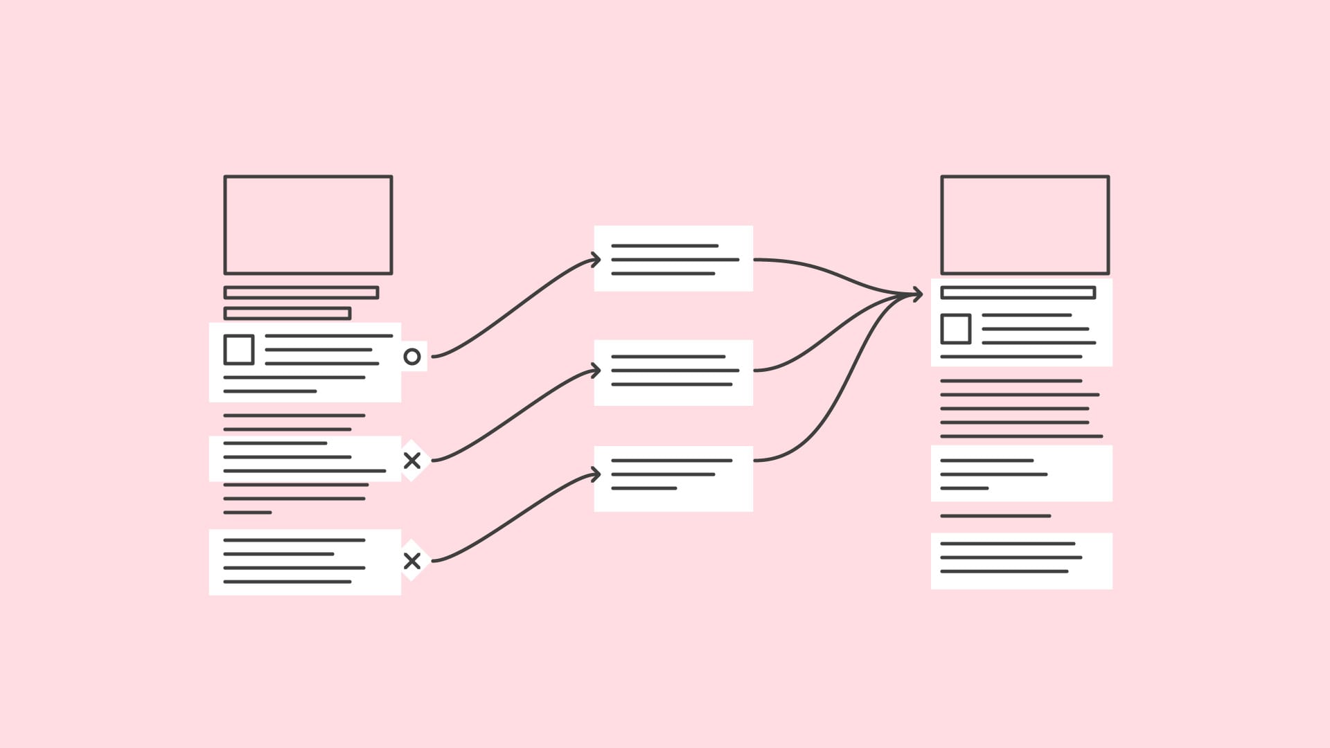
Add alt text to images
Alt text is a written description of an image that allows users with vision impairments to engage with images online. Alt text becomes important when the image in a post is necessary to understanding the overall message, but not all alt text carries the same value.
Suppose you’re sharing a post from a community event with a photo of a group of volunteers. The copy reads: “Huge thanks to the volunteers that made this possible!” The copy alone is not enough to tell the whole story of the post, so you should use alt text to make the post accessible to all users. A bad example of alt text would be “Image of volunteers.” A good, valuable alt text may say, “A large group of volunteers in matching orange shirts poses in front of an open field.”
Add closed captions to videos
Closed captions on social videos have become standard in the industry. Closed captions allow users with hearing impairments to understand what is happening in a video while having the added benefit of letting all users watch a video without turning the sound on. Even if the video doesn’t have any talking, it’s still a good idea to add some text explaining the audio so that users don’t feel left out. Something as simple as “Baroque music playing” or “Tubthumping by Chumbawumba plays” should do the trick.
Many platforms, like Facebook and Youtube, can generate automatic captions that will save you time, but you may risk some accuracy in the subtitles. If you have the time, it’s always better to write your own captions for social videos. Also be mindful when editing a video that no key visual information will be covered up once closed captions are added.
Avoid embedding text in your images
Some users with vision impairments use screen magnifiers to zoom into images and text for a clearer view. Text that is overlaid on an image can be pixelated and fuzzy when magnified, making it difficult to read. Always try to include important text in the copy of a post for easy readability.
When text is necessary for an image or graphic, use high contrast colors
For social graphics, make sure that there is a good contrast between the color of text and the color of the background. Users with vision impairments may have trouble reading text with low color contrast. Since a large portion of social media is accessed through mobile devices with small text, the minimum recommended color contrast is 5.0:1. Learn how to check color contrast on Google Chrome here.
Here are some other best practices for typography on an image:
- Use only sans serif font families—serif fonts make things harder to read
- Don’t use an overly ornate font
- Use italics sparingly
Be mindful about link text
A screen reader’s job is to read every textual element on a page, and that includes link text. Some platforms, like Facebook and LinkedIn, give you the option of removing the link text from a post and keeping the link preview. But other platforms, like Twitter, still keep link text in the copy of a post.
When link text can’t be removed from a post, make sure the post copy does a good job of explaining where the link will send a user. You can also use a link-shortening service like bit.ly to make the link shorter and easier for a screen reader to read.
Accessibility Resources
Large social platforms, like LinkedIn, Twitter, and Facebook, all have some degree of assistance available to users wanting to create accessible content and helpful tips for users with disabilities to navigate the platform.
The Facebook Accessibility help page provides answers to common questions regarding the platform and assistive technology. You can also follow Facebook Accessibility on Facebook or Twitter to stay up-to-date on new accessibility features on the platform.
Twitter hosts a similar accessibility-focused account that provides updates about accessibility features. The account has the purpose of being “dedicated to making Twitter as inclusive as possible.”
The Instagram Help Center can provide support to users trying to make accessible content, although Instagram’s accessibility features are pretty sparse.
LinkedIn also has an accessibility help page. LinkedIn has become a powerful tool to help people find jobs and make professional connections, but the platform has come under fire for its lack of accessibility presenting barriers to users with disabilities. LinkedIn claims to be constantly improving its accessibility features, including adding alt-text options earlier this year.
We can give you a hand
At Happy Medium, we always do our part to make the web a friendlier place for every user. We pride ourselves on a human approach to all things digital, so if you have a website or social presence that needs a little life, let’s chat.
The (Not So) Secret Code to Web Accessibility
- Use CSS Focus states to highlight tabbing elements
- Make your forms accessible
- Make accessible accordions
- Ensure accessibility is maintained when content is exported
- Be thoughtful with modals and animation
- Add descriptive values to your alt=”” tags when uploading images
When it comes to web development, accessibility is more than just adding alt tags to your images. So if you came here looking to read about the easiest elements to change, this blog is not for you (don’t worry, we’ll show you how to add alt tags too).
It’s almost a cliché now to talk about how pervasive the internet is in modern life. We use the web to buy goods, pay bills, and stay in touch with friends and family across the globe. Nearly anything we want to know is accessible within a handful of keystrokes, and the division between the online world and our real lives is becoming pretty blurry. But users with disabilities, who make up about 15% of the population, encounter online barriers that don’t exist for the rest of us. And these hurdles can keep these users from enjoying the full capability of the 21st century web.
We see all too often that websites aren’t designed or coded with accessibility in mind. There’s no doubt that building an accessible website will take some extra time and effort. But a little elbow grease is a small price to pay for a website that invites all users. Happy Medium puts a lot of work into making the design and layout of a website ideal for accessibility, but in order to reach the full potential of an inclusive web, we’ve got to start talking 1s and 0s.
Here are some tips for how to code a website for accessibility from the Happy Medium web development team.
- Use CSS Focus states to highlight tabbing elements
People who use power keyboards need to see which elements they are selecting. It’s common for a user to tab from one item to the next, see the destination URL change in the bottom left-hand side of the screen, and be left wondering which element on the website they are clicking on.Without dedicated focus state highlights, users can’t easily determine what they’re clicking on. Ambiguity should be avoided at all costs when it comes to web design, so here’s how you fix it.To communicate a change in the focused element:a:focus { outline: 3px solid orange; }To communicate that once a link is made active, we remove an underline:
a:active { text-decoration: none; } - Make your forms accessible
Use theelement to associate text with form elements. When you do this, you need to use the “for” attribute and have it match exactly to the “id” of the form control.<label for="username">Username</label> <input id="username" type="text" name="username">This is the most basic way to make form fields accessible. We highly recommend against hiding the form label or using text within the form field to describe the purpose of the field. Lighter-weight text can be hard to see for users with vision impairments. Make it easy to input text by putting your labels outside the box.
- Make accessible accordions
Make your accordions a tabbing-accessible button so that keyboard users are able to access the contents within.<section class="accordion-section"> <div class="accordion" role="presentation"> <div class="js-accordion__panel"> <h3 class="accordion__heading"> <button class="accordion__trigger" aria-controls="accordion__content_1" aria-expanded="false" tabindex="0" id="accordion__title_1" aria-selected="false">I’m tall when I’m young and I’m short when I’m old. What am I? >/button> </h3> <div class="accordion__content" id="accordion__content_1" role="region" aria-hidden="true" aria-labelledby="accordion__title_1"> <p>A candle</p> </div> </div>As a rule of thumb, we like to see if an entire website can be navigated with single key strokes. This shows us whether we’ve done a good job as developers making a site as accessible as possible.
- Ensure accessibility is maintained when content is exported
Some websites require users to export content into common file formats like PDF. When content is exported from an accessible site, it’s important to ensure that the content remains accessible. At Happy Medium, we achieve this by using Prince XML. This software allows us to export an HTML page into an accessible PDF that maintains all the accessibility of the original webpage. (Hint: You need to be running version 12.5 or later.)If you’re uncertain about the accessibility of your exported PDFs, use Acrobat DC’s Accessibility Checker to go through your document and make the elements accessible. - Be thoughtful with modals and animation
Modals and animations are a great way to bring a website to life and provide a dose of visual appeal. However, information or sensory overload can cause challenging behaviors or meltdowns among users with Autism Spectrum Disorder. Animated modals that include blinking, flickering, or flashing can be a serious distraction and considered inaccessible for some users.We recommend strategic use of CSS and Javascript to slow down nonfunctional animations. The animations won’t lose their visual appeal, but they will become more welcoming for all users.Set fair animation lengths:div { transition: width 2s; }Set fair iteration counts:
      div {
          animation-iteration-count: 3;
      }
Or in JS:
var target = document.querySelector('.box'); var player = target.animate([ {transform: 'translate(0)'}, {transform: 'translate(100px, 100px)'} ], 2000); player.addEventListener('finish', function() { target.style.transform = 'translate(100px, 100px)'; }); - Add descriptive values to your alt=”” tags when uploading images
Our blog series on accessibility has already mentioned alt tags a handful of times, but we can not emphasize how and simple, yet important, this task it. Humans rely more on sight than any other sense, and web users with vision impairments should be able to interact with visual elements on a page the same way you or I can.Making users with vision impairments rely on nondescript alt tags is like making a person watch a movie without wearing glasses. Could they get the gist of the film from watching a blurry image? Probably. But do they lose a lot from the experience? Absolutely.Here’s a good example of a useless alt tag compared to a valuable one:
Incorrect: alt=”image of Kodie Grantham”Correct: alt=”A casually dressed man with short brown hair and long beard sits behind a desk with pint-glass in hand. He’s surrounded by personal items and collectables, including an electric guitar and skateboard sitting at his feet”
Why does it matter?
As builders of the web, we should feel a shared responsibility to make it a welcoming and inclusive place. After all, developers do play a role in allowing people with disabilities to participate in essential parts of society. If empathy alone isn’t enough to encourage accessible coding, maybe these performance benefits of an accessible website will do the trick.
- Better SEO Results
Alt text and other accessibility features can help your page rank higher in search results. Google considers accessibility so important, they even include it as part of their mission statement. - Lower Bounce Rates
If a webpage isn’t built for accessibility, it will immediately turn away users that rely on accessibility tools like screen readers or other assistive technology. - Competitive Advantages
Building a more accessible site than your competitor’s sites puts you in a better position to serve users that your competitors can’t.
Small Steps, Big Impact
Coding for accessibility is not a large investment. The work itself isn’t terribly complicated to complete. It just takes a little more time. A competent dev shop should be able to complete any accessibility work, and oftentimes it’s easier than most of the work we’re doing anyway. The biggest adjustment most teams need to make is beginning every project with the same goal of improving accessibility of the internet.
If you’ve got a website that could use a facelift or an accessibility audit, let’s chat.
Three Ways to Design a More Visually Accessible Web
When I talk to a client about making their website accessible, the first thing many of them do is apologize.
To me.
Personally.
Because I’m a designer.
As if designing a website that’s accessible is somehow akin to asking me to design in Papyrus or Comic Sans.*
And I get it.
There have been times that I’ve chosen aesthetics over accessibility. There have been times when I’ve chosen something cool over something clear. There have been times when I thought I could get away with it just this one time.
And I’ve regretted every one of those choices.
While accessible design does have some restrictions, it’s not impossible to incorporate as long as you’re thoughtful, empathetic, and persistent. Creative results can still be achieved in tandem with accessibility goals.
And what designer doesn’t want a guarantee of being able to communicate more clearly with a wider audience?
What designer doesn’t relish the opportunity to serve a vastly underserved audience?
And what designer doesn’t want to do their part to make the web a better place?
So, whenever I feel the urge to make something pretty rather than practical, I always remind myself of these three ways to make sure that what I design is accessible.
Don’t Make Text Tiny
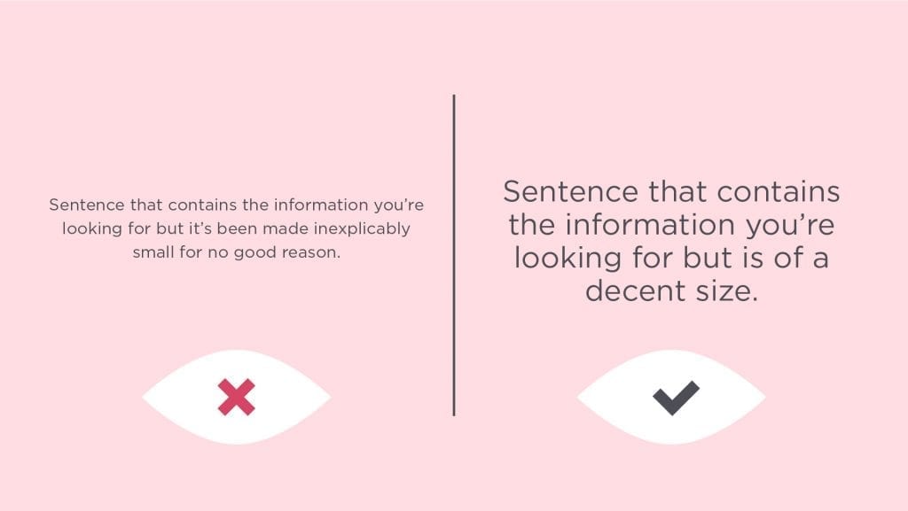
If you go back a decade ago, you’ll find that all text was sort of tiny.
I think part of this was so that people could cram as much information into a small space as possible in a vain and misguided attempt to stay above the fold. I also think this was because a lot of designers and developers didn’t realize that pixels and points didn’t have a 1:1 ratio when it came to text.
Or they didn’t care.
For many of us, everything could still be read, but for some, it was impossible. In recent years, the average text size has increased due to better research, usability advocates, and a user preference for scrolling (thanks phones!).
And the thing is, all this larger text hasn’t negatively impacted anyone. People with less than perfect eyesight can actually read what they couldn’t before, and in fact, everyone else has an easier time reading with less eye-strain.
It’s a win-win.
But every once in awhile, I still see sites that have text that’s way too small. Sometimes it’s because maybe no one knew any better. Sometimes it’s because they just needed to get other content to fit. In the latter case, my argument is:
If it’s important enough to be included, it’s important enough to be legible.
Don’t Choose Low-Contrast Colors for Text
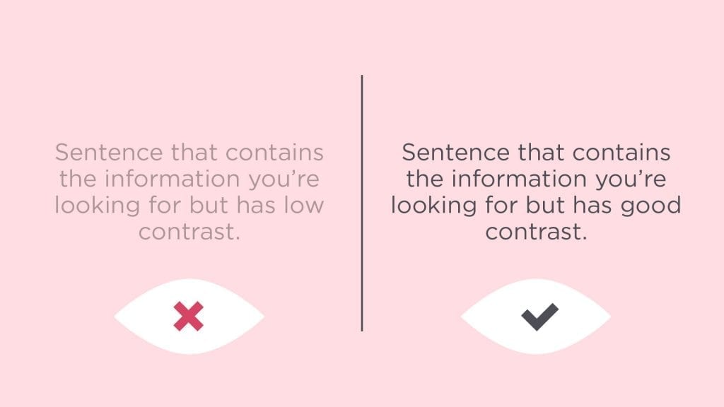
Subtlety is something that designers like to work with. There’s something about carefully selecting colors that stand out, but not too much. We try to balance things on the edge.
However, subtlety is a pretty subjective concept. While we might be able to see all of that these subtleties, not everyone is able to.
The objective standard is to use WCAG’s guidelines to achieve and surpass the AA and AAA success criteria.
Essentially, what the AA and AAA standards prescribe are contrast ratios that need to be achieved between text and background.
These standards also tie specific contrast ratios to different sizes of text.
For example.
AA requires a ratio of 4.5:1 for normal text and 3:1 for large text.
AAA requires a ratio of 7:1 for normal text and 4.5:1 for large text.
I lean on Web Accessibility In Mind to help me calculate the ratios so I know I have a more objectively accessible design. They’ll also tell you what they mean by “large” text.
Additionally, LyftDesign released their new ColorBox tool that can help you put together entire color systems.
What all this means is that I still have a lot of flexibility to use colors in interesting ways, but I also have guidelines to make sure as many people can appreciate it as possible. Additionally, this really only applies specifically to text. All of those super low-contrast shades can still be used in areas that don’t require people to read.
Advocate for Accessibility
None of these rules really matter if you can’t convince stakeholders and clients to go along with these decisions, so it’s important that you speak up about accessibility. More often than not, your clients want their content to be communicated well, and they want their website to be accessible; they just may not be able to articulate it well or know it when they see it. It’s up to designers (along with developers and UX professionals) to help articulate why it’s so important.
So bring it up at pitch meetings, discoveries, and presentations.
Talk about it at every touchpoint.
Make sure they know it’s important—if for no other reason than you won’t shut up about it.
If you do the above three things, then you’ll be doing your part to make the web a better, more accessible place to be.
*Comic Sans is actually considered to be fairly accessible.
How to Write Content for Website Accessibility
In his 1946 essay Politics and the English Language, author George Orwell provides a few basic rules for good, clear writing. Professors and editors have been praising the gospel of these rules to young writers for generations since. You probably know some of them without realizing it:
- Never use a long word where a short word will do.
- If it’s possible to cut a word out, always cut it out.
- Never use the passive [voice] where you can use the active.
- Never use a foreign phrase, a scientific word, or a jargon word if you can think of an everyday English equivalent.
We care about good writing here at Happy Medium and try to follow these rules. Doing so gets your message across to your audience and can help boost search engine optimization (SEO). But the rules also have another positive effect: making the web accessible to people with disabilities.
What is Accessible Content?
The Americans with Disabilities Act covers a lot of ground, but it’s up in the air whether it applies to websites and other digital content. Which means the federal government has not created any sort of standards or guidelines.
Fortunately, for those who still care, there is a longtime, ongoing project called the W3 Web Accessibility Initiative. They have a massive collection of “strategies, standards, and resources to make the web accessible to people with disabilities.” In the absence of ADA guidelines, these are the gold standard.
Among nearly every other facet of the web, they also provide a list of where to start with content and writing.
What Are Web Content Accessibility Guidelines
You can follow George’s rules above and get pretty close to W3’s standards. But for those who like a little bit more clarity, the group has seven guidelines you can use to assess your content. Here is a quick website accessibility checklist:
Page Titles
When creating a page for your website, always write a short and clear title that describes what the page is about and helps differentiate it from the rest of your site.
These titles are what show up on the tab of your browser, and some people with disabilities use assistive technology like screen readers to read this content.
Try not to get too clever or abstract with your titles. For example, if you’re creating a page to list all of the events your organization hosts, avoid titles like “What We’re Up to.” Instead, go with “Organization’s Events” or simply “Events.”
Page Headings
The text directly above this sentence is called a heading. Up above, “What Are Web Content Accessibility Guidelines,” is another heading. The title of the blog way up at the top—you guessed it—is also a heading.
Using headings helps improve your content in several ways. For people who may have difficulty reading or for people using screen readers, it helps add another level of meaning and structure to your content. Headings make your writing easier to follow and understand.
They also help improve your SEO. Search engines like Google use these headings as one way of figuring out what your page contains.
Link Text
Descriptive link text is something that we still struggle with here at Happy Medium. When we say descriptive link text, we mean making sure your inline links and buttons tell users exactly what happens when they click.
So for example, a button or sentence that just sends with “click here” is not very descriptive. There’s no indication for what happens when a user clicks there.
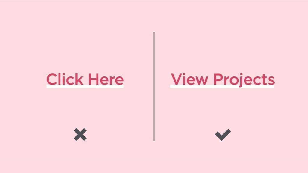
In some instances, saying “click here” can work, but you have to make sure the text preceding the link is unequivocal about what happens upon clicking.
The best option is just to write button or link text that explains what will happen next.
Alt Text
Alternative text, or alt text, is the information that shows up when an image fails to load. It is also what screen reader software sees when reading a page. The general public is usually unaware of alt text since it doesn’t show up often. For people with visual impairments, alt text serves the same function as the image.
So for example, in the image below, bad alt text would just be “woman with ball.”
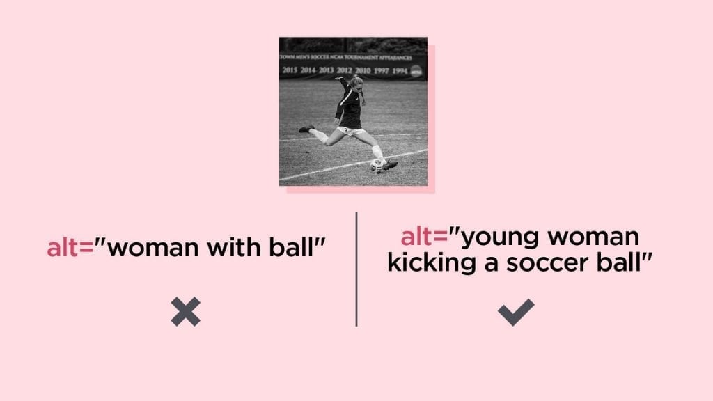
Better alt text would be more like “young woman kicking a soccer ball.”
When creating alt text, write as if you’re replacing the image with your words.
Multimedia
For any multimedia content on your site, you should provide some kind of caption or transcript. This includes videos and podcasts, or for certain gifs. That way, people with visual impairments can still access the information.
Instructions
Making accessible forms requires clear instructions. This is an instance where good writing, good user experience, and accessibility all align.
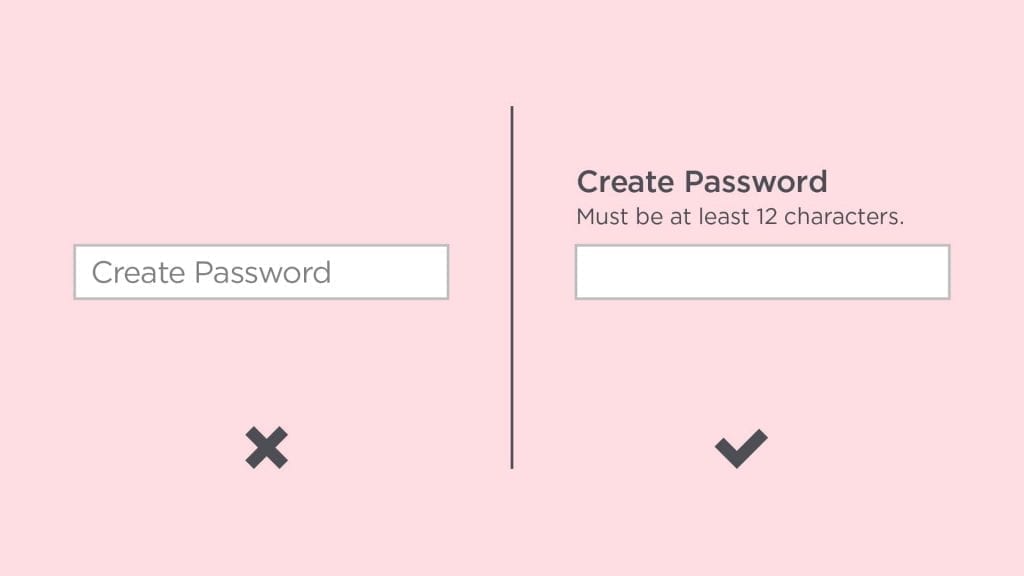
So for example, when asking someone to create a password, you should put clear guidelines next to the form field. It’s important to put it in a permanent spot—not helper text inside the box that disappears when typed over. Password requirements need to be visible at all times.
There’s nothing more frustrating than having to go back in a form because a field is wrong for some unknown reason.
If you need to write out a set of instructions, do your best to keep things simple and succinct. Consider breaking up long paragraphs into bullet points or numbered lists, or using an instructive image to help (but don’t forget the alt text).
Body copy
Finally, you should always try to use clear and concise writing in your content. That includes all of George’s rules in the bullet points above. But also consider things like breaking text into more readable chunks—you’ll notice almost no paragraph in this article is longer than 2–3 sentences.
It’s also a best practice to have someone edit your writing, or at least proofread for you. If you can’t get anyone to edit, try reading your copy aloud. You’re more likely to find awkward sentences and poor grammar when you read out loud to yourself.
How to Make the Web More Accessible
Depending on how you look at it, the good news and the bad news is that just simply trying to write for accessibility can put you light years ahead of other websites.
If you’re an optimist, this means that putting forth a good effort counts for a lot. If you’re a pessimist, this means that hardly any of the web is considered accessible, and that doing literally anything means you’re doing more than the next guy.
But the reality is that retrofitting the web for people with disabilities will take a lot of time and effort. Hardly anyone will be able to get it right on the first try—we here at Happy Medium still struggle with it.
Part of our company purpose is making the web a happier place. And for us, that means building it as an accessible place to begin with. If you’re concerned about improving your website, contact us. We’d be glad to give you a refresh or even rebuild from scratch.
Assistive Technologies and Inclusive Personas for the Web
Take time to empathize with people in order to create an inclusive user experience for all.
Real talk: many designers and developers create unusable experiences for people with disabilities. It’s an issue that has plagued the internet for years—but has been especially hot news recently. Reasons for this could be inexperience, corner-cutting, or flat-out apathy and indifference. To these designers and developers, I challenge you: read the personas at the end of the article and tell me that you still don’t give a hoot.
Accessibility is About Empathy
Imagine you’re in a store. You need coffee and pickles. You gaze up at the signs above the aisles, navigate straight to the items, and head to check out. You swipe your items across the scanner, pay, and get out.
While the majority of us are walking through this grocery store with no problem, there are two people with vision impairments in the store who are utterly lost, confused, and frustrated. Think of how that number grows when we include people with cerebral palsy and autism spectrum disorder. These three groups of people have their own tools to help them, but if the grocery store is laid out in a completely illogical way, user pain and frustration are inevitable! Who do you think that responsibility falls on? The customer? No.
It’s probably obvious what question I’ll pose next—what if this grocery store is actually a website? 3 to 6 to 10 people out of 100 are going to feel powerless trying to navigate a site that hasn’t been built to acceptable accessibility standards.
Become an Advocate
I haven’t forgotten about the UX community. The UX community needs to continue pushing for web accessibility and become better advocates for accessible design. As user experience designers, we have one priority: matching a good experience to the intended users. However, good UX professionals know that intended users and all users are completely different things. That means becoming familiar with the tools used by different groups of people in order to accommodate the largest possible segment of users. Enter, assistive technologies (ATs).
What is a screen reader? It’s an assistive technology used to identify readable elements on a web page, that then uses that information to read the text aloud. ATs help people with disabilities achieve their goals. There are many other assistive technologies out there besides screen readers. There are braille keyboards, special styluses, screen magnification software, and speech input software.
Planning for Accessibility
The majority of us don’t often see people using ATs to interact with the internet or other software in our everyday lives. But, it happens…every single day, people use this technology. So why would we intentionally sacrifice usability for design? Many designers and developers just flat out don’t know how to code or design for accessibility. If you’re one of those people, here are a few tips (thank me later):
- Double-check your color-contrast ratios between the background and the text. This helps people with blurry vision.
- Manually check the resize function to enlarge the text on your site (Cmd + “plus sign” or Ctrl + “plus sign”). People over 65 use this function all the time.
- Make sure that content is laid out in a logical tabbing order for someone who is using a stylus instead of a mouse to navigate the site.
- Make sure your navigational titles are clear and consistent.
- Provide alternative text for images. A detailed description of the image is ALWAYS better when helping the user identify what it is when using a screen reader.
- Double-check that form fields are labeled correctly with text outside of the field. Placeholder text inside form fields is often read differently by screen readers, and many browsers and ATs don’t support them. Not only that, but they often have lower contrast ratios and disappear when you start typing. Just avoid placeholder text altogether.
Building Personas
One good way to make sure you’re planning and designing for accessibility is to build personas for your expected users. Much like marketing or sales personas, these profiles help you keep your ideal audience in mind. Making note of their frustration points can help you assess your work to make sure you’re working toward inclusivity. Here are a few examples to help get you started:
Gail
User Role
HR Specialist
AT’s Used
Tablet with stylus
Scooter with joystick control
Speech-to-text apps
Background
Gail is a fun-loving millennial who works at a large corporation in Des Moines, IA as an HR specialist. She has cerebral palsy (CP) but works alongside several people who often help her get unstuck when navigating the company’s intranet.
She has a 4-year-old rescue pup named Terry (a.k.a T-Bone) and lives in a small independent living community.
Motivations & Goals
She loves working with people in her community to improve interview skills, gain professional readiness, and build good work habits.
Frustrations & Pain Points
She has movement control issues in her hands, so when websites don’t have large click targets for her stylus, she can get frustrated to the point of giving up. She gets very irritated with websites that don’t design for tablet views.
Gail can speak at a better level than most people with CP. This allows her to utilize speech to text fairly well. She still feels like this technology is in its early stages because most people aren’t dependent on it, and software companies don’t see a priority to make it better.
Very independent and hates asking peers for help to navigate her company’s own resources.
Marcus
User Role
Student at Dallas Autism Career College
AT’s Used
Smartphone
Text enlargement
Wearable tech
Background
Marcus falls between the middle and the high end of the autism spectrum. He says he still has his good days and bad days like everyone else.
He’s been going to this college that helps people like him get jobs.
This college has a room that is a complete replica of a Target warehouse and checkout lanes. That’s where he and his friends get experience in fulfilling orders and performing transactions. He loves using the scanner to count inventory.
He uses a task assistant on his phone and smartwatch to make sure he eats his lunch at the same time every day. He’s anxious that his entire day will collapse if he doesn’t.
Motivations & Goals
Wants to become independent from his family, but sometimes he thinks he wants that, only because he knows they want that for him.
Frustrations & Pain Points
Gets highly distracted on websites that have a lot of things going on: “My life is made easier when I see that ‘reader view available’ icon on my phone. Sometimes I wish all websites were just text.”
He’s great at video games, but has trouble learning new websites. Becomes very upset when a website that he’s been using for a long time does a redesign and they change labels of important things, and no idea where to find the information he needs.
Adam
User Role
Sales rep for a piston ring manufacturer
AT’s Used
VoiceOver (Mac) and NVDA (PC) screenreaders
Braille display
Voice recorder
Background
Adam has been blind since birth, but has been able to succeed in a world that he understands is pretty unaware of the blind.
He grew up in a small town, and to many, he was the first blind person they had ever met. That’s okay, because he loves to explain to them how they can be advocates.
Motivations & Goals
He loves meeting new people and networking. That’s why Facebook and LinkedIn are usually where he gets his leads.
He’s motivated by the competitive environment with his sales peers. He’s really motivated by quarterly numbers.
Frustrations & Pain Points
He can’t stand it when he lands on a potential lead’s website and the reading order of the content is broken. His screen reader jumbles paragraphs and design elements when this happens.
He also knows that people have the ability to add alternative text to photos, so he views blank alt text fields as a deplorable practice. Just as worse, he gets frustrated when people add the text but it’s nondescript! Alt text that reads “picture of boy” helps no one.
Nick’s Closing Thoughts
The internet wasn’t built overnight — and fixing accessibility issues isn’t an overnight solution. But just by trying to incorporate more of these tactics as you change your website, you can help make the web a friendlier place. Or better yet, if you plan on starting from scratch any time soon, get a hold of us. We can help you build your site to be accessible and compliant from the ground up.
Caution! Contents Hot!
Content can mean a lot of things. Here’s how to make it mean more.
There was a time when social media was, you know, social. When Facebook would ask, “What’s on your mind?” and meant it. Since those days, social media has become a relentless machine. It constantly churns, chewing up weak family photos (vertical group picture, really?) and spitting them out the other side.
In this social media arena, you’re only as hot as your latest post, and engagement is the newest form of currency. These are facts of life for joes like you and me. But for brands, forced to swim upstream and compete with algorithms created to limit their reach, this is a bit of a problem.
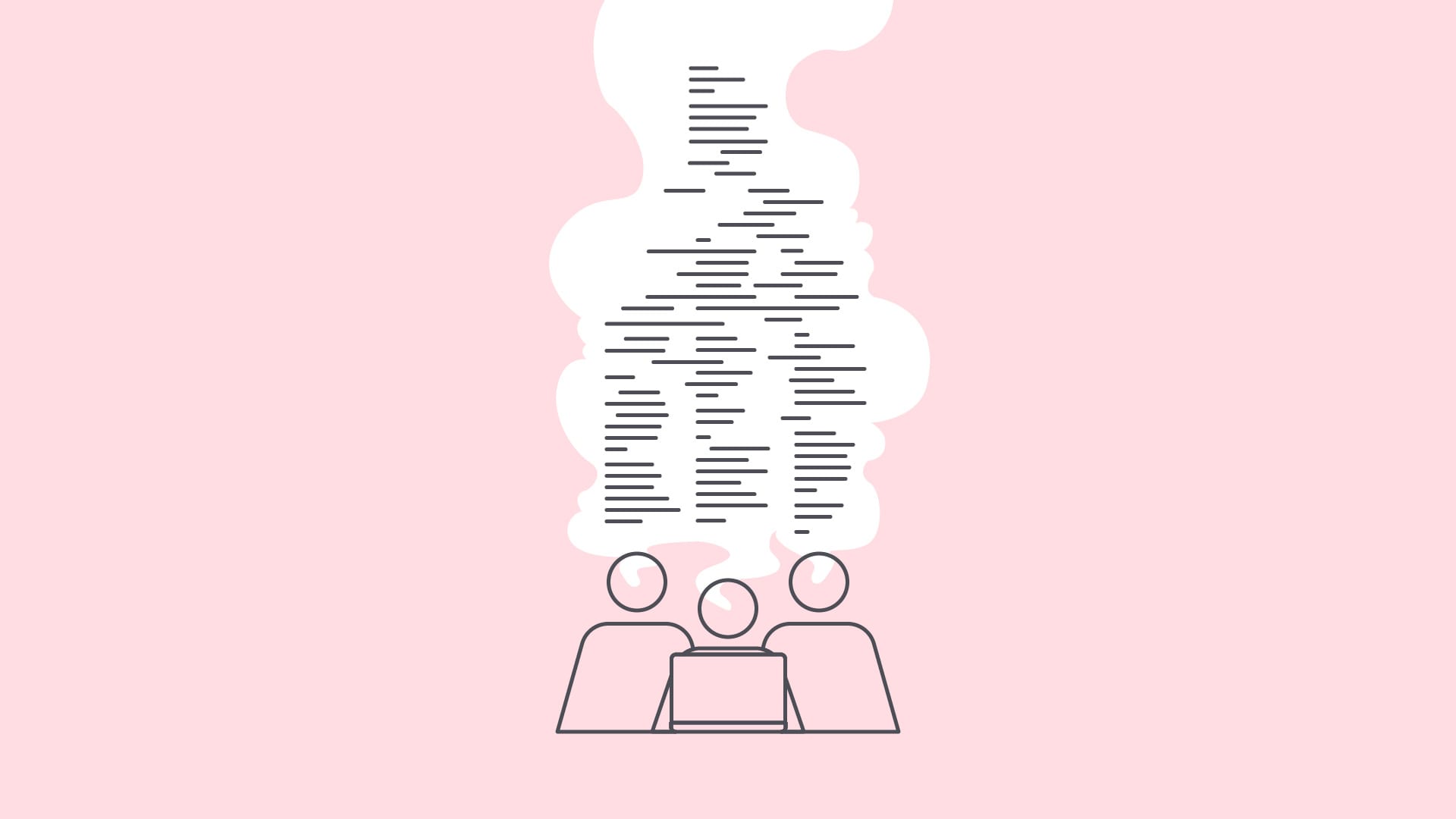
Social media professionals have a habit of competing in staring contests with blank content calendars, thinking first, “This. Must. Get. Filled.” but leaving what to fill it with as an afterthought.
Literally anything can technically be considered content, which is to say anything can fill a blank space in a content calendar. But in a social landscape that is increasingly cluttered, and with organic reach on the decline, it takes more than just any content to move the needle.
It takes a lot of work to transform your “content” into Content. All it takes is knowing your audience, understanding value, and a little experimentation.
I Want You to Want Me
The most important ingredient in breaking through social noise is to make sure your content provides value to your target audience. Users follow brands because they expect the brand to improve their social experience in some way. To provide value to users is to make good on this promise. We want users to want our content, and by extension, our brand.
Value, like the term content itself, is a bit nebulous. But for content to provide value, you first need to think about who you are talking to and what they want to hear from your brand.
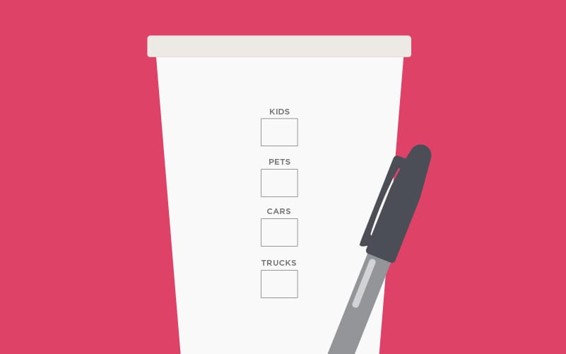
Who Are You
Building valuable content requires knowing who your social audience is and what makes them tick. Do they like the outdoors? Do they have kids or pets? Are they more likely to drive a pickup truck or a sports car? Relevant questions like these can help you understand your audience more as humans and less as social users, which in turn helps you build content that is valuable to them.
Knowing your audience is critical for being genuine on social media.
Start by asking yourself, “Why did these people follow me in the first place?”
If they use your products, they may be in search of tips or updates. Maybe they just like the aesthetics of your feed. Who knows! You must have done something right to attract fans in the first place. Take a step back and nail down what people expect from your brand, and build your content around these expectations.
Just What I Needed
One of the great powers of social media is that each platform (for better or worse) collects a bunch of data about users that is valuable to content purveyors. You can know the age, location, and even general interests of your social following, which equips you with even more information to create content tailored to your audience.
It’s possible to make some assumptions based on simple demographic characteristics. But as with any form of targeting, the more granular your understanding, the more tailored your content can be. This usually means digging into some numbers to learn more about your audience.
All social platforms have some sort of native analytics feature that provides audience information with varying degrees of usefulness. These free tools are great places to start understanding your audience, but be careful not to mistake all information with good information.
For example, audience analytics for the Happy Medium Twitter account tell us that 99% of our audience likes dogs, 60% are interested in the weather, and 54% of the audience uses Verizon for their wireless coverage. Not the most useful, is it?
Instead, determine beforehand what information will be most valuable to you or your client. Then seek that out, rather than trying to make use of whatever metrics you can find.
Break on Through
Understanding the expectations and interests of your social audience is the first step to creating valuable content for them. Now it’s time to sharpen your pencils and start putting your findings to work, writing content that breaks through the clutter.
Once again, you are met with a blank content calendar and a deadline, but now that you know your audience inside and out, you can be more strategic and intentional with the content you write, which will help evaluate success later down the road.
I Walk The Line
Marketing of any discipline requires you to step into the shoes of the audience and walk around. For successful social content, think about the space your brand occupies in the mind of your audience and make sure the posts fit what the audience expects.
A clothing brand posting about classical literature or auto racing is not creating content with audience expectations in mind, which could result in losing a follower (or a few). Find a balance between what your brand wants to say and what the audience wants to hear, then post about it in a way that is enjoyable to consume.
Perfect content will be relevant to the audience, relevant to the brand, and relevant to the platform.
Come Together
Creating on-brand content that doesn’t actively annoy your audience will keep your brand on news feeds, but a little more work is necessary to get the engagement that marketers crave. Now is the time to start building some themes or content types that will appeal to your audience.
Suppose you run social media for a bakery. A few possible content types could be customer testimonials, posts about new products or specials, or employee spotlight posts. The key is coming up with content types that achieve specific goals, like raising awareness of product offerings or attracting new employees. Of course, these content types are informed both by your understanding of the audience and their expectations.

Don’t be afraid to experiment with different types of content—you may get surprising results.
I recommend coming up with 4–5 unique content types to start. You will find that some content will perform worse than the rest, and once those are eliminated from the calendar, you will have a few winners to keep and leave some space to experiment a little more.
All Killer No Filler
While marketers have a strong desire to always be in front of consumers, sometimes value means knowing when to back off. To evoke a cliche, always choose quality over quantity.
While you may decrease the number of touchpoints you have with the audience, prioritizing quality ensures that each interaction will be a valuable one.
What’s Going On
Set regular intervals to evaluate content performance as a whole and look into the health of each content type you create. At Happy Medium, we report monthly on social performance for our clients. Evaluate too often and you can lose the forest from the trees, but too much time between reports might allow underperforming content to overstay its welcome.
I always say that evaluating social performance is like evaluating your stock portfolio. You wouldn’t sell off all your stocks after one down month, and you shouldn’t completely overhaul your social strategy after one down month either. Keep an eye out for trends, and if any start to form, that’s when you need to take notice.
After the leg work is done, all you have to do is look at the performance of each content type on its own. Ditch the laggards, build off the successes, and before you know it, you’ll have a well-oiled content machine.
Call Me Maybe
As you can tell by now, a lot goes into a robust and valuable social media presence. It can be difficult to know where to start or find the time to analyze and evaluate your content properly. If you or your company need some help getting your plan off the ground, give us a call.
How to Run a Business Blog in 2019
Senior copywriter and content enthusiast Dan MacKenzie helps lay out the reasons for having a business blog and provides us with the best ways to go about filling it with information.
English majors are having a good decade. This is finally our time. Content is king. Everyone wants to have a blog and produce their own content. But as we find here at Happy Medium, not many people know how to make it happen. English majors to the rescue!
Writing a blog is easy if you have writers on staff. But for the rest of the world that can’t hire people with questionably useful college degrees, finding content for your blog can seem intimidating. Here are some strategies to help you do it right.
Wondering How to Start a Blog?
First, I want to make it clear that not everyone needs a blog. But it can be helpful for a lot of organizations. If you start a blog, it’s important to maintain it with regular updates. It can look bad if the last post you have is from 4 years ago.
 You should have a purpose or a goal for running your blog.
If you’re considering it, here are four possible reasons you would put forth the effort to maintain one.
SEO
Regularly updating your website shows search engines that you are invested in keeping your information relevant for users. While changing your home page or service pages every month probably doesn’t make sense, adding a new blog each month is a relatively easy task.
It also gives you a chance to build up your keyword relevance. If your blogs begin to rank on search engines for certain words, it helps raise the SEO profile for your domain overall.
Sales Support
Your blog is an excellent way to help frame conversations that sales or other external teams are having with users.
If your industry is changing quickly, is difficult to understand for outsiders, or involves complicated products, creating blog posts that clarify or answer common questions can be a great support for those teams.
Thought Leadership or Information Source
Thought leadership is really a subset of SEO and sales support, but your blog is a good place to demonstrate your company’s vision or opinion on developing issues. By staking an early claim on hot topics, your users, clients, or customers may come to see you as the leader in your field (and come to you for help on complex issues).
Likewise, if there is a lot of news in your industry, you can establish your blog as a single source for otherwise disparate information. Acting as an aggregator of varied news can be a valuable service for certain users.
Drive Revenue
If content is a foundation of your business model, you can use advertising on your blog to drive revenue. This requires a pretty strong dedication to content creation as users will only visit your site if you’re constantly producing worthwhile content.
Once you have your strategy laid out, the next obvious question is how do you create blog content?
The Best Ways to Write a Blog, Ranked
 You, your marketing team, or the full team can all pitch in on writing blogs.
1. Creating blogs from scratch
This is the absolute best option. It takes the most effort, but you gain the most from the work.
Filling your blog with original, relevant content establishes your organization as a leader in your industry—it helps establish a reputation as a knowledgeable source for information.
And as stated, it will also help increase your SEO rankings. The more new, varied content you have on industry-related topics, the stronger your site will look to search engines like Google.
You don’t necessarily have to have a writer on staff. You can crowdsource ideas from your team and take turns writing blogs. They can be as short as 300 words or so, and it’s easier when you do it as a team.
2. Hiring freelancers to write blogs
This is nearly as good as writing your own blogs, but it comes with the upfront cost of hiring and “training” freelancers. In addition to finding writers, you’ll likely need to talk with your accounting department regarding tax forms needed for reporting freelance work.
Finding writers can be done through services like Upwork or Fiverr. These services are sort of like professional Craigslist sites. You can browse freelancers by skill set, location, and specialty. The freelancers have reviews from past clients, and some feature examples of work.
Once a writer is located and hired, you’ll need to brief them on the ins and outs of your industry. A good freelancer will know what questions to ask, but there will be a slight learning curve.
Once you develop a relationship with one or more writers, the effort drops significantly. You now have a resource for writing blogs whenever you want.
3. Creating commentary or analysis of existing news articles
If the primary purpose of your blog is to inform your users about industry news, this may be a good option for you.
This is a fairly common format where you link to external sources, but add a paragraph or two that helps explain why the article is important or the key takeaways.
The key to success for this format is to add valuable insight beyond the article itself—give your users a reason to go through you rather than straight to the source.
 You can provide value through analysis of other articles.
4. Quoting other articles as part of a blog
This is really just an extended form of #3. Rather than linking off to another site, you quote the relevant part of the article in your own blog. The idea is that you create a little “conversation” within your post or react to the main points of the other article.
This format can get tricky, though, as the rules for Fair Use in copyright law are complex. Because you would presumably be reusing the content for commercial purposes—to try and drive businesses to your blog—the bar for Fair Use is a bit higher.
Generally speaking, as long as you aren’t reproducing “significant portions” of the original article and you are adding meaningful insight or commentary, you’re in the clear. (This does not constitute legal advice, I am not a lawyer.)
5. Linking directly to a third-party article
In this instance, you would have an entry on your blog landing page, but instead of adding any of your own commentary for an article, you would link directly to that site. This allows you to fill your blog page but is not strongly recommended because it actively drives traffic away from your site.
This is an acceptable option if your goal is to act as a new aggregator for your audience.
6. Using a licensing service to buy blog content
Services like Written will connect you with existing high-performing content to post on your site. Essentially the company finds content related to the topics you want to talk about, then pays the original author for the rights to place the content on your site instead.
This, of course, comes with a cost. However, you also may see disproportionate benefits from SEO. If Written is able to find a high-performing article for you to license, it can generate a significant amount of traffic for your site.
Not Recommended
We cannot recommend under any circumstance that you repost articles in their entirety. As discussed in #4, Fair Use is generally working against you in any type of commercial endeavor, exposing you to the chance of lawsuits. If you really want to use existing articles, use #3 or #4 above.
You’re a Blogger Now
That’s it. By using these strategies, you have all of the pieces you need to start creating a blog. If you need help creating space on your site for your blogs (or you need a new site altogether), let us know. Our team would love to help you create something.
The Terrible UX of Our Own Front Door
The first in an ongoing series from our User Experience (UX) Designer, Nick Throckmorton, we explain how and why a user’s experience on a website is the way it is (…or should be). This month, how a website experience relates to that of an old, awful, poorly designed wooden door in Happy Medium’s building.
The UX of Objects and Scenarios
I like to think that the “UX of something” is an arbitrary degree of how much I enjoyed or loathed interacting with an object. I use this phrase in my day-to-day life to describe something that was pleasant or unpleasant, and that probably could’ve been built better with the help of an experienced UXer. For example:
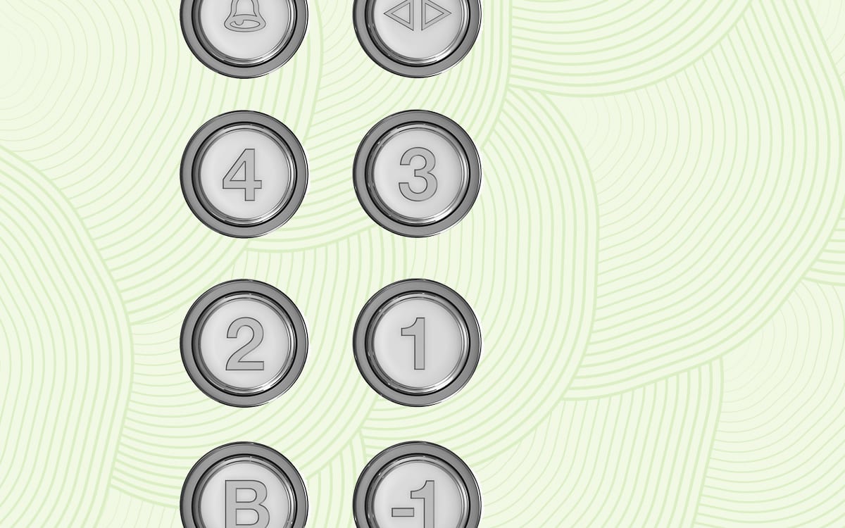
“This elevator keypad has some seriously bad UX: inconsistent layout, no audio feedback after pressing a button, and no braille for the visually impaired.”
“This banana has fantastic UX. I peeled it in three even strands, I’m not hungry anymore, and it left my hands fresh and clean!”
Designers and developers need to lend ourselves to this way of thinking. Whether you realize it or not, user experience is in everything—even, say, doors—and that will never change.
Our Door
Doors have been around since 5000 B.C. (probably). You would think that we would’ve mastered them by now. They open, they close. They swing out fast, then slowly come back. Some rotate! And with those, you only have to push. No pulling needed.
The Happy Medium staff works in a historic building called The Rumely, which was inducted into the National Register of Historic Places in 1989.
As with all remnants of a past time, you need to show them a little love over the years to keep them fresh and up-to-date. In the case of The Rumely’s front doors, patches have been made over the years that now interrupt user journeys, punish user error, and hinder learnability.
Everyday objects are rife with UX errors.
The Norman Door
Doors with bad UX are not a new concept. Don Norman, the so-called father of UX and co-founder of Nielsen-Norman Group, has written about and presented on products with bad UX for the last quarter of a century. He says when it comes to fans sending photos of poor design in real life, “Doors are the most common culprit.”
Often times as owners of websites, we need to check and see if a “Norman Door” is staring our users right in the face. At Happy Medium, most employees enter and exit the building through separate, secure, and perfectly working doors in the back. We often forget that clients walk through the front of the building, which is where our Norman Door is located.
This incredibly frustrating piece of design violates any number of UX conventions around consistency, ease of use, and user access.
It features two separate sets of identical French doors that open inward instead of swinging outward, a steep flight of seven stairs in between them, a double key fob security system (just to double-check that the person who made it up the stairs hasn’t changed since they were granted access by the first keypad), and entirely too many different kinds of handles.
Normally when you need to pull a door, there is a vertical handle. When you need to push, there is a horizontal. Our doors have both, but in different sets. Plus they have a decal that says “push,” but you can read it from both sides. So no matter which way you’re traveling, you have a split-second hesitation on whether you’re supposed to read the decal or not. All of which, I’m sure, was done to be helpful at some point.
Interestingly enough, we see a lot of our prospective clients doing the same thing with their website. They access the site through the back end to see if everything is working and if analytics are being tracked. But they never bother to get on the other side of the screen and experience their changes or patches from a user’s perspective (or use the front door, as it were).
Testing Your Doors
A few things we can check to avoid Norman Doors are navigation, consistency, cognitive load, and most importantly, interactions.
Navigation
Put yourself in your user’s shoes. If you need information fast, what common web page element are you going to look for? Probably the search bar—unless you’re not sure what resource you’re looking for. In this case, the user believes they are on the right site. And they’d know the right information if they saw it. They just have to find it. In which case, most users usually look to the nearest navigational menu for help.
Here are some tips to ensure your users can easily find what they need from the nav:
- Make navigational menus obvious, and place them in obvious locations, e.g. the top right corner.
- Make the menu look interactive. I don’t mean fancy when I say interactive—I mean make it look like something will happen if I click it.
- If it’s a very large website with different components, utilize a mega menu. A mega menu essentially consolidates many smaller categories under fewer larger categories.
Consistency
Consistency doesn’t mean that you have to use the same template or pattern for every page on your site. When it comes to page layout, there should be some uniform look and feel, but I’m talking more about being consistent with users’ expectations for all websites:
- Good content
- Responsive design (mobile-friendly)
- Quick page-load speed
- Easily accessible contact information
- Scrolling abilities (if needed)
There’s a long list of user expectations, but this should be a good place to start. If you’re sitting there thinking to yourself that these sound similar to common SEO signals, then you’re correct! My advice is to think about designing for humans first. And if you do that well, good rankings will follow.

Sometimes the most simple and classic designs provide the best UX.
Cognitive Load
The term cognitive load was coined in the late 1980s by John Sweller, an Australian psychologist. In short, it means “working memory.” Neilsen-Norman Group (remember Don Norman?), states that two types of cognitive load relate to websites and user experience.
Intrinsic cognitive load is the working memory that we use to achieve goals of what we’re currently trying to do. Think of it as the bottom-line CPU that a computer needs to run. It’s been said that we can never fully eliminate this type of cognitive load—and even if we did, it wouldn’t be helpful.
The second is extraneous cognitive load, which is all of the “noisy” factors that are happening around in our external environment. This type of cognitive load takes up precious mental resources that we would otherwise need to fully comprehend what we’re doing.
When it comes to websites, there are certain types of extraneous visual clutter that take up this precious mental space:
- Irrelevant images that provide no value to the content that accompanies them.
- Redundant links that occur throughout the entire page.
- Layout designs that interrupt a user’s thought process.
- Unnecessary typography changes.
Designing with these items in mind can help our chances of reducing extraneous cognitive load, and avoiding unintentional Norman Doors.
Try to offload certain tasks: Replace large content blocks with one image, or put example text in form fields.
Finally, design websites with existing mental models in mind. Builds off of users’ previous knowledge of websites in order to cut down on the amount of learning it’s going to take to use your site. (Don’t reinvent the wheel.)
Interactions and Animations
Arguably, one of the most important aspects of good UX is being able to manage your interactions properly. Animation falls under the huge umbrella of “interaction.”
Nonfunctional animations are mostly used for entertainment, aesthetics, and cheap parlor tricks (shots fired!).
Functional animation is used to reflect or convey an action to a user. Whenever you press down on your phone’s keyboard and the letters get bigger on each keystroke, that’s functional animation. That small piece of animation shows you that you did something and that you should expect an event to occur.
Here are some questions to ask yourself before you add an animation that inadvertently becomes a Norman Door:
- Does this interaction or animation guide the user’s attention to something important?
- Does this animation help a user achieve a goal?
- Am I wasting a user’s time or attention by making them wait through this?
- Does the nonfunctional animation add to the aesthetics while also keeping in line with the site’s design guidelines?
Both nonfunctional and functional animations can be powerful when used sparingly and with purpose, but don’t let creativity get in the way of function.
Open and Shut
Norman Doors don’t build themselves. They’re built by people who aren’t able to—or don’t think to—see things from a user’s perspective. Use these tips as a guide to analyze your own site.
If you thought you were going to hear a shameless plug at the end of this article—you were right! We at Happy Medium fix Norman Doors of all shapes and sizes (but digital only, please. We’re not great carpenters.)
We have a team of design professionals who have not only seen Norman Doors on websites but also in the flesh. Reach out to us if you think there are some Norman Doors lurking around your website.
6 Things That Help Build a Visual Brand Identity
Hi, I’m Paige. I’m a visual designer at Happy Medium. I’ve worked here for several years now and have had a similar conversation with many different clients around visuals and brand identity. So I wanted to share some thoughts that might help you, too.
Oftentimes, we work with clients who have no existing branding or identity. With these clients, we’re starting from scratch to build their visual systems.
But we work with many more clients that have existing identity systems—they have their guidelines and directions already set in place for us to work with. Even with those clients, we sometimes recommend an identity refresh as part of a website update.
Sometimes clients love the idea of a new or updated identity; but other times the response is “we like our logo.” And so I’ve come to understand that clients don’t often realize that there are other visual components of a website that can support the logo. And that can be updated without changing a beloved logo!
When we say identity, we mean a visual system that works together to represent a company. This includes translating company values into visuals and matching their digital representation with their real-world characteristics.
So, what exactly is an “identity system” when it comes to your website?

Time to Run
First, I’ll explain why we recommend updates in the first place. Part of our process includes a discovery meeting where we find out what clients’ goals are. We ask them to run through their visual goals in addition to other business goals.
Clients usually feel comfortable naming their business goals or functionality needs, but naming visual goals is harder. It’s understandable since people don’t think like that every day. So we do exercises around what they like or don’t like about other websites.
In some cases, we find that their stated goals or desired visual goals don’t align with their existing identity system.
For example, the client might provide custom services or a one-of-a-kind approach to their customers, but their website looks run-of-the-mill. Or, maybe a client wants to attract a younger audience, but their current site is dated. Even more, clients want to appear customer-focused but their site doesn’t show who their customer is.
That’s when it’s time for a new, refreshed, or updated identity system.

The Balancer’s Eye
Once we align with the customer on all the goals, the question becomes how to turn those goals into a system. Here are the main areas we try to balance.
Photography & Imagery
This is the visual heart of a site—it’s a big part of establishing the feel and look. With the advent of visual social media, we’ve started to find that people think photography is an easy process. Many people don’t realize the work that goes into good imagery—and the amount of time needed to curate those accounts.
But a good brand—and designer—can add visual appeal and strategy to each image.
For example, if a client wants to feature their people, we make sure to include employee headshots or photos of the business in action. Or if they want to seem approachable, we show customer interaction or eye contact with the camera.
We can focus on products by showcasing the story of the product, not just inventory shots. Or we can even do conceptual photography that captures intangible ideas if the client is involved in the services sector.
If the client wants to exude experience or trustworthiness, we show the gritty details of their work being done. And if a company is all about taking risks, then shouldn’t their photography have some edge?
Iconography
Icons are important because they can stand in when photography or imagery can’t be used.
This can be because of the volume of images needed, because something is “unphotographable,” because of some kind of language barrier, or because there is no room for the text needed to say what the icon can say on its own.
Icons can help organize information, like if clients have many different services that need to be quickly differentiated from each other, or if they have many different programs you administer.
Of course, icons can also help tie a website back to its goals, like helping add different feelings in context.
Typography
I’ve found that this is an area where most people are unfamiliar. Everyone knows why to choose Helvetica instead of Comic Sans. But the professional decisions among fonts for visual identities is more difficult to communicate.
Tying a brand to a font is about small details. Take serif styles—they’ve come to be associated with experience and trust. Universities have used these for a long time, so they have picked up sort of a sophisticated reputation.
Rounder terminals and soft edges tend to make you seem approachable. (Terminals are the spots where letters end.) And fonts that have letters with both thin and thick lines are often associated with femininity. You’ll notice these fonts in beauty and fashion brands.
On top of those nuances, we have to make sure that fonts work well together if we’re using more than one.
Patterns & Textures
By patterns and textures, we mean repeated visual motifs that become an element of the identity or that help evoke emotions.
For example, if a client wants rugged or earthy, we could use textures that give a distressed look. If they want luxury, we might use a marble texture to convey that products are high-quality. Or if they want a modern feel, a simple geometric pattern can help add visual depth to the identity.
These patterns and textures end up playing a subtle but important supporting role in the identity system.
Color
People are way more comfortable with color. This is unsurprising since we choose colors every day—from outfits to phone background photos.
If a client has no colors as part of an existing identity, we will choose a few options that, again, tie to their company attributes or organizational goals.
Much of the time, though, a client will have at least one or two colors that we work with. We usually end up expanding those colors because they won’t work for the web on their own—many clients just haven’t had a reason to expand their existing palettes in this way. Color variation adds depth to a site, so we make sure to use a variety of colors from lighter tones to mid-tones and deeper shades.
We also tie back to some basic tenets of color theory. If a client wants a welcoming feel, we select lighter, brighter colors. If they want to radiate luxury, we suggest neutral tones. Or if they want to convey a healthy, natural vibe we go with earth tones.
Audience Needs
All of the above should feel authentic to the organization. But we also need to make considerations for the audience. To start, we always try to keep in mind users with disabilities—employing easily readable typography and colors that offer good contrast.
Other considerations might include more nuance. Like if a client sells products for toddlers, product attributes might be playful and kid-friendly…but their actual buyer is the parent, so the design needs to be attractive to them as well.

Secret of Life
Hopefully, this gives you a taste of the secret tricks that go into creating a visual system. When we work with you, please know that all of this work is a thoughtful investment. Take the time to think seriously about your organization’s image and how you want to convey it. When you’re ready to start your own refresh, please get a hold of us. In the meantime, check out the design services on our website.