
When I talk to a client about making their website accessible, the first thing many of them do is apologize.
To me.
Personally.
Because I’m a designer.
As if designing a website that’s accessible is somehow akin to asking me to design in Papyrus or Comic Sans.*
And I get it.
There have been times that I’ve chosen aesthetics over accessibility. There have been times when I’ve chosen something cool over something clear. There have been times when I thought I could get away with it just this one time.
And I’ve regretted every one of those choices.
While accessible design does have some restrictions, it’s not impossible to incorporate as long as you’re thoughtful, empathetic, and persistent. Creative results can still be achieved in tandem with accessibility goals.
And what designer doesn’t want a guarantee of being able to communicate more clearly with a wider audience?
What designer doesn’t relish the opportunity to serve a vastly underserved audience?
And what designer doesn’t want to do their part to make the web a better place?
So, whenever I feel the urge to make something pretty rather than practical, I always remind myself of these three ways to make sure that what I design is accessible.
Don’t Make Text Tiny
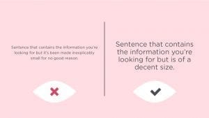
If you go back a decade ago, you’ll find that all text was sort of tiny.
I think part of this was so that people could cram as much information into a small space as possible in a vain and misguided attempt to stay above the fold. I also think this was because a lot of designers and developers didn’t realize that pixels and points didn’t have a 1:1 ratio when it came to text.
Or they didn’t care.
For many of us, everything could still be read, but for some, it was impossible. In recent years, the average text size has increased due to better research, usability advocates, and a user preference for scrolling (thanks phones!).
And the thing is, all this larger text hasn’t negatively impacted anyone. People with less than perfect eyesight can actually read what they couldn’t before, and in fact, everyone else has an easier time reading with less eye-strain.
It’s a win-win.
But every once in awhile, I still see sites that have text that’s way too small. Sometimes it’s because maybe no one knew any better. Sometimes it’s because they just needed to get other content to fit. In the latter case, my argument is:
If it’s important enough to be included, it’s important enough to be legible.
Don’t Choose Low-Contrast Colors for Text
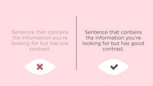
Subtlety is something that designers like to work with. There’s something about carefully selecting colors that stand out, but not too much. We try to balance things on the edge.
However, subtlety is a pretty subjective concept. While we might be able to see all of that these subtleties, not everyone is able to.
The objective standard is to use WCAG’s guidelines to achieve and surpass the AA and AAA success criteria.
Essentially, what the AA and AAA standards prescribe are contrast ratios that need to be achieved between text and background.
These standards also tie specific contrast ratios to different sizes of text.
For example.
AA requires a ratio of 4.5:1 for normal text and 3:1 for large text.
AAA requires a ratio of 7:1 for normal text and 4.5:1 for large text.
I lean on Web Accessibility In Mind to help me calculate the ratios so I know I have a more objectively accessible design. They’ll also tell you what they mean by “large” text.
Additionally, LyftDesign released their new ColorBox tool that can help you put together entire color systems.
What all this means is that I still have a lot of flexibility to use colors in interesting ways, but I also have guidelines to make sure as many people can appreciate it as possible. Additionally, this really only applies specifically to text. All of those super low-contrast shades can still be used in areas that don’t require people to read.
Advocate for Accessibility
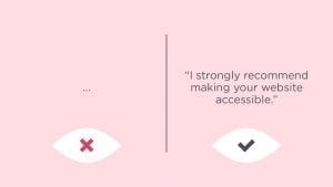
None of these rules really matter if you can’t convince stakeholders and clients to go along with these decisions, so it’s important that you speak up about accessibility. More often than not, your clients want their content to be communicated well, and they want their website to be accessible; they just may not be able to articulate it well or know it when they see it. It’s up to designers (along with developers and UX professionals) to help articulate why it’s so important.
So bring it up at pitch meetings, discoveries, and presentations.
Talk about it at every touchpoint.
Make sure they know it’s important—if for no other reason than you won’t shut up about it.
If you do the above three things, then you’ll be doing your part to make the web a better, more accessible place to be.
*Comic Sans is actually considered to be fairly accessible.