Let's chat.
Every great partnership started with a first step. Let’s get talking.
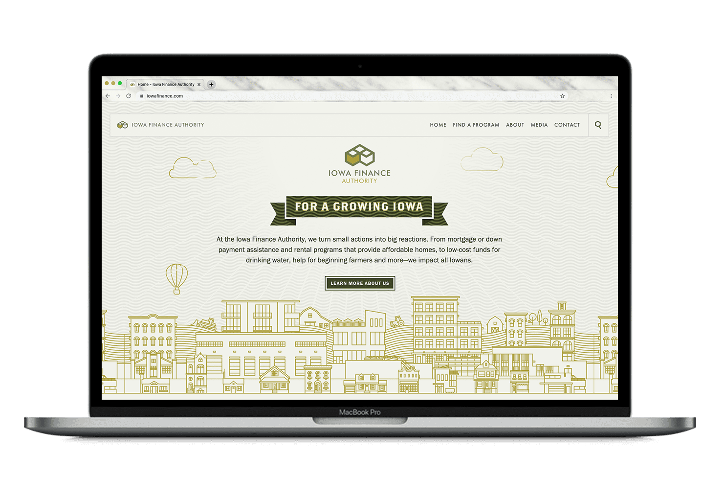
The Iowa Finance Authority (IFA) website had good bones, but there was a lot of potential to improve the user experience and overall design.
Happy Medium was ready to make IFA’s new website a place that housed more than just information. We wanted to make the website a place where any user could be successful. We knew IFA’s website had an essential role in building confidence among users to help them discover everything IFA has to offer.
We developed a strategy and vision for the new website that put users at the core while demonstrating the importance of IFA and how it makes Iowans’ lives better through its services and programs. We wanted the new website to feature improved functionality, an updated look/tone/feel, and solve common problems for users. That’s how we were able to build a modern, engaging, and easy-to-use website that helped varied users find the information they need to use an IFA program.

We created a content management system that would allow content managers to easily update the website — no matter their capabilities. We also provided simple patterns and structures to the new website so IFA’s content managers could add the most important updates and information in real-time, bringing more awareness to IFA’s purpose, programs, and progress.
The creative direction for IFA’s new site focused on a clean, inviting environment that’s practical and helpful for users. We wanted users to feel welcome once they came to the new website — just like IFA helps Iowans feel at home. The new website design elevates IFA’s brand and identity while making content, including copy, photos, and other visual elements, more compelling and in line with other marketing materials.
The UX was all about creating a website for IFA that made users feel comfortable and in control of how they accessed important information — while still communicating IFA’s purpose and value. We revamped the site structure and navigation because this is where many users experienced friction. We also found ways to streamline and refine the structure and navigation to remove any redundancies, encouraging users to explore and browse content while also ensuring they accomplish what they intended to.
SEO upgrades would position the new website in front of more users who performed an online search for the products or services that IFA offered. We leveraged existing IFA keywords, but also expanded this list to include more industry terms. We also created more compelling calls-to-action that would bolster organic traffic to the new IFA website, submitted a new sitemap to search engines for crawling practices, and added meta titles to aid in local search ranking.
I’m (now) getting a bunch of business from IFA, and a lot of people are finding me from the new website, which means they’re able to navigate it.
Closing on a loan is typically the final step in the mortgage process. And in this case, closing on a new website was the last step for IFA in creating a better user experience that also made information about their services and programs within reach. After more than a year of work, IFA has a new website they’re proud to call theirs, and it serves thousands of Iowans each day.
Every great partnership started with a first step. Let’s get talking.