The first in an ongoing series from our User Experience (UX) Designer, Nick Throckmorton, we explain how and why a user’s experience on a website is the way it is (…or should be). This month, how a website experience relates to that of an old, awful, poorly designed wooden door in Happy Medium’s building.
The UX of Objects and Scenarios
I like to think that the “UX of something” is an arbitrary degree of how much I enjoyed or loathed interacting with an object. I use this phrase in my day-to-day life to describe something that was pleasant or unpleasant, and that probably could’ve been built better with the help of an experienced UXer. For example:
“This elevator keypad has some seriously bad UX: inconsistent layout, no audio feedback after pressing a button, and no braille for the visually impaired.”
“This banana has fantastic UX. I peeled it in three even strands, I’m not hungry anymore, and it left my hands fresh and clean!”
Designers and developers need to lend ourselves to this way of thinking. Whether you realize it or not, user experience is in everything—even, say, doors—and that will never change.
Our Door
Doors have been around since 5000 B.C. (probably). You would think that we would’ve mastered them by now. They open, they close. They swing out fast, then slowly come back. Some rotate! And with those, you only have to push. No pulling needed.
The Happy Medium staff works in a historic building called The Rumely, which was inducted into the National Register of Historic Places in 1989.
As with all remnants of a past time, you need to show them a little love over the years to keep them fresh and up-to-date. In the case of The Rumely’s front doors, patches have been made over the years that now interrupt user journeys, punish user error, and hinder learnability.

Everyday objects are rife with UX errors.
The Norman Door
Doors with bad UX are not a new concept. Don Norman, the so-called father of UX and co-founder of Nielsen-Norman Group, has written about and presented on products with bad UX for the last quarter of a century. He says when it comes to fans sending photos of poor design in real life, “Doors are the most common culprit.”
Often times as owners of websites, we need to check and see if a “Norman Door” is staring our users right in the face. At Happy Medium, most employees enter and exit the building through separate, secure, and perfectly working doors in the back. We often forget that clients walk through the front of the building, which is where our Norman Door is located.
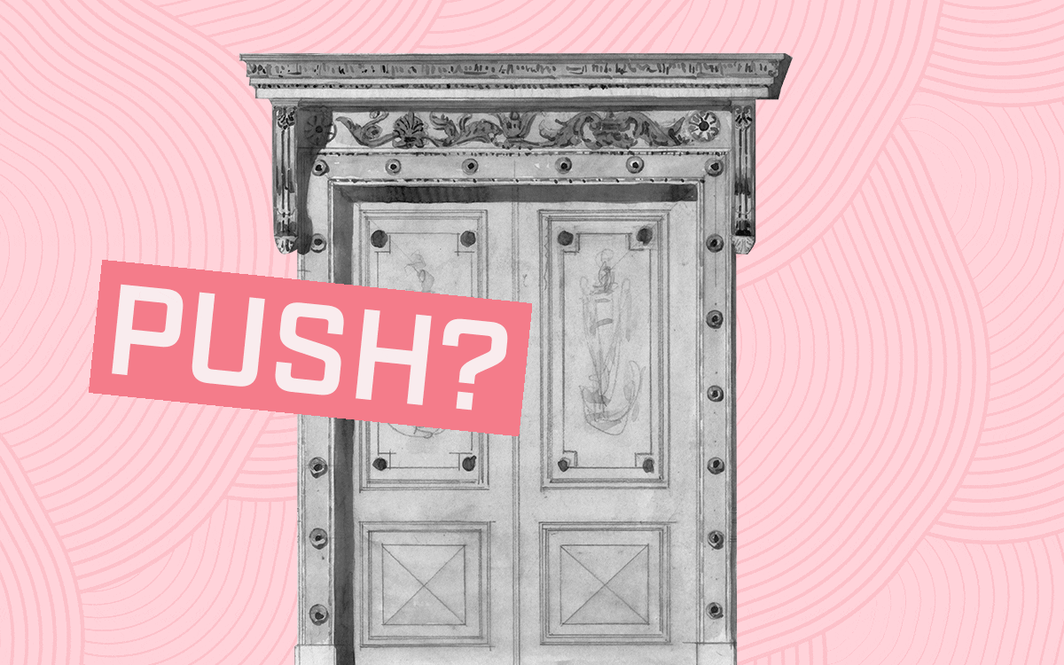
This incredibly frustrating piece of design violates any number of UX conventions around consistency, ease of use, and user access.
It features two separate sets of identical French doors that open inward instead of swinging outward, a steep flight of seven stairs in between them, a double key fob security system (just to double-check that the person who made it up the stairs hasn’t changed since they were granted access by the first keypad), and entirely too many different kinds of handles.
Normally when you need to pull a door, there is a vertical handle. When you need to push, there is a horizontal. Our doors have both, but in different sets. Plus they have a decal that says “push,” but you can read it from both sides. So no matter which way you’re traveling, you have a split-second hesitation on whether you’re supposed to read the decal or not. All of which, I’m sure, was done to be helpful at some point.
Interestingly enough, we see a lot of our prospective clients doing the same thing with their website. They access the site through the back end to see if everything is working and if analytics are being tracked. But they never bother to get on the other side of the screen and experience their changes or patches from a user’s perspective (or use the front door, as it were).
Testing Your Doors
A few things we can check to avoid Norman Doors are navigation, consistency, cognitive load, and most importantly, interactions.
Navigation
Put yourself in your user’s shoes. If you need information fast, what common web page element are you going to look for? Probably the search bar—unless you’re not sure what resource you’re looking for. In this case, the user believes they are on the right site. And they’d know the right information if they saw it. They just have to find it. In which case, most users usually look to the nearest navigational menu for help.
Here are some tips to ensure your users can easily find what they need from the nav:
- Make navigational menus obvious, and place them in obvious locations, e.g. the top right corner.
- Make the menu look interactive. I don’t mean fancy when I say interactive—I mean make it look like something will happen if I click it.
- If it’s a very large website with different components, utilize a mega menu. A mega menu essentially consolidates many smaller categories under fewer larger categories.
Consistency
Consistency doesn’t mean that you have to use the same template or pattern for every page on your site. When it comes to page layout, there should be some uniform look and feel, but I’m talking more about being consistent with users’ expectations for all websites:
- Good content
- Responsive design (mobile-friendly)
- Quick page-load speed
- Easily accessible contact information
- Scrolling abilities (if needed)
There’s a long list of user expectations, but this should be a good place to start. If you’re sitting there thinking to yourself that these sound similar to common SEO signals, then you’re correct! My advice is to think about designing for humans first. And if you do that well, good rankings will follow.

Sometimes the most simple and classic designs provide the best UX.
Cognitive Load
The term cognitive load was coined in the late 1980s by John Sweller, an Australian psychologist. In short, it means “working memory.” Neilsen-Norman Group (remember Don Norman?), states that two types of cognitive load relate to websites and user experience.
Intrinsic cognitive load is the working memory that we use to achieve goals of what we’re currently trying to do. Think of it as the bottom-line CPU that a computer needs to run. It’s been said that we can never fully eliminate this type of cognitive load—and even if we did, it wouldn’t be helpful.
The second is extraneous cognitive load, which is all of the “noisy” factors that are happening around in our external environment. This type of cognitive load takes up precious mental resources that we would otherwise need to fully comprehend what we’re doing.
When it comes to websites, there are certain types of extraneous visual clutter that take up this precious mental space:
- Irrelevant images that provide no value to the content that accompanies them.
- Redundant links that occur throughout the entire page.
- Layout designs that interrupt a user’s thought process.
- Unnecessary typography changes.
Designing with these items in mind can help our chances of reducing extraneous cognitive load, and avoiding unintentional Norman Doors.
Try to offload certain tasks: Replace large content blocks with one image, or put example text in form fields.
Finally, design websites with existing mental models in mind. Builds off of users’ previous knowledge of websites in order to cut down on the amount of learning it’s going to take to use your site. (Don’t reinvent the wheel.)
Interactions and Animations
Arguably, one of the most important aspects of good UX is being able to manage your interactions properly. Animation falls under the huge umbrella of “interaction.”
Nonfunctional animations are mostly used for entertainment, aesthetics, and cheap parlor tricks (shots fired!).
Functional animation is used to reflect or convey an action to a user. Whenever you press down on your phone’s keyboard and the letters get bigger on each keystroke, that’s functional animation. That small piece of animation shows you that you did something and that you should expect an event to occur.
Here are some questions to ask yourself before you add an animation that inadvertently becomes a Norman Door:
- Does this interaction or animation guide the user’s attention to something important?
- Does this animation help a user achieve a goal?
- Am I wasting a user’s time or attention by making them wait through this?
- Does the nonfunctional animation add to the aesthetics while also keeping in line with the site’s design guidelines?
Both nonfunctional and functional animations can be powerful when used sparingly and with purpose, but don’t let creativity get in the way of function.
Open and Shut
Norman Doors don’t build themselves. They’re built by people who aren’t able to—or don’t think to—see things from a user’s perspective. Use these tips as a guide to analyze your own site.
If you thought you were going to hear a shameless plug at the end of this article—you were right! We at Happy Medium fix Norman Doors of all shapes and sizes (but digital only, please. We’re not great carpenters.)
We have a team of design professionals who have not only seen Norman Doors on websites but also in the flesh. Reach out to us if you think there are some Norman Doors lurking around your website.