Hi, I’m Paige. I’m a visual designer at Happy Medium. I’ve worked here for several years now and have had a similar conversation with many different clients around visuals and brand identity. So I wanted to share some thoughts that might help you, too.
Oftentimes, we work with clients who have no existing branding or identity. With these clients, we’re starting from scratch to build their visual systems.
But we work with many more clients that have existing identity systems—they have their guidelines and directions already set in place for us to work with. Even with those clients, we sometimes recommend an identity refresh as part of a website update.
Sometimes clients love the idea of a new or updated identity; but other times the response is “we like our logo.” And so I’ve come to understand that clients don’t often realize that there are other visual components of a website that can support the logo. And that can be updated without changing a beloved logo!
When we say identity, we mean a visual system that works together to represent a company. This includes translating company values into visuals and matching their digital representation with their real-world characteristics.
So, what exactly is an “identity system” when it comes to your website?
Time to Run
First, I’ll explain why we recommend updates in the first place. Part of our process includes a discovery meeting where we find out what clients’ goals are. We ask them to run through their visual goals in addition to other business goals.
Clients usually feel comfortable naming their business goals or functionality needs, but naming visual goals is harder. It’s understandable since people don’t think like that every day. So we do exercises around what they like or don’t like about other websites.
In some cases, we find that their stated goals or desired visual goals don’t align with their existing identity system.
For example, the client might provide custom services or a one-of-a-kind approach to their customers, but their website looks run-of-the-mill. Or, maybe a client wants to attract a younger audience, but their current site is dated. Even more, clients want to appear customer-focused but their site doesn’t show who their customer is.
That’s when it’s time for a new, refreshed, or updated identity system.
The Balancer’s Eye
Once we align with the customer on all the goals, the question becomes how to turn those goals into a system. Here are the main areas we try to balance.
Photography & Imagery
This is the visual heart of a site—it’s a big part of establishing the feel and look. With the advent of visual social media, we’ve started to find that people think photography is an easy process. Many people don’t realize the work that goes into good imagery—and the amount of time needed to curate those accounts.
But a good brand—and designer—can add visual appeal and strategy to each image.
For example, if a client wants to feature their people, we make sure to include employee headshots or photos of the business in action. Or if they want to seem approachable, we show customer interaction or eye contact with the camera.
We can focus on products by showcasing the story of the product, not just inventory shots. Or we can even do conceptual photography that captures intangible ideas if the client is involved in the services sector.
If the client wants to exude experience or trustworthiness, we show the gritty details of their work being done. And if a company is all about taking risks, then shouldn’t their photography have some edge?
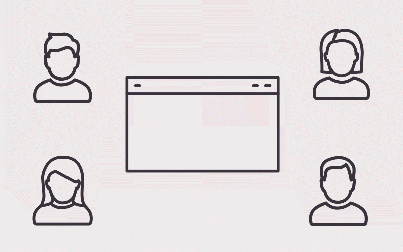
Iconography
Icons are important because they can stand in when photography or imagery can’t be used.
This can be because of the volume of images needed, because something is “unphotographable,” because of some kind of language barrier, or because there is no room for the text needed to say what the icon can say on its own.
Icons can help organize information, like if clients have many different services that need to be quickly differentiated from each other, or if they have many different programs you administer.
Of course, icons can also help tie a website back to its goals, like helping add different feelings in context.
Typography
I’ve found that this is an area where most people are unfamiliar. Everyone knows why to choose Helvetica instead of Comic Sans. But the professional decisions among fonts for visual identities is more difficult to communicate.
Tying a brand to a font is about small details. Take serif styles—they’ve come to be associated with experience and trust. Universities have used these for a long time, so they have picked up sort of a sophisticated reputation.
Rounder terminals and soft edges tend to make you seem approachable. (Terminals are the spots where letters end.) And fonts that have letters with both thin and thick lines are often associated with femininity. You’ll notice these fonts in beauty and fashion brands.
On top of those nuances, we have to make sure that fonts work well together if we’re using more than one.
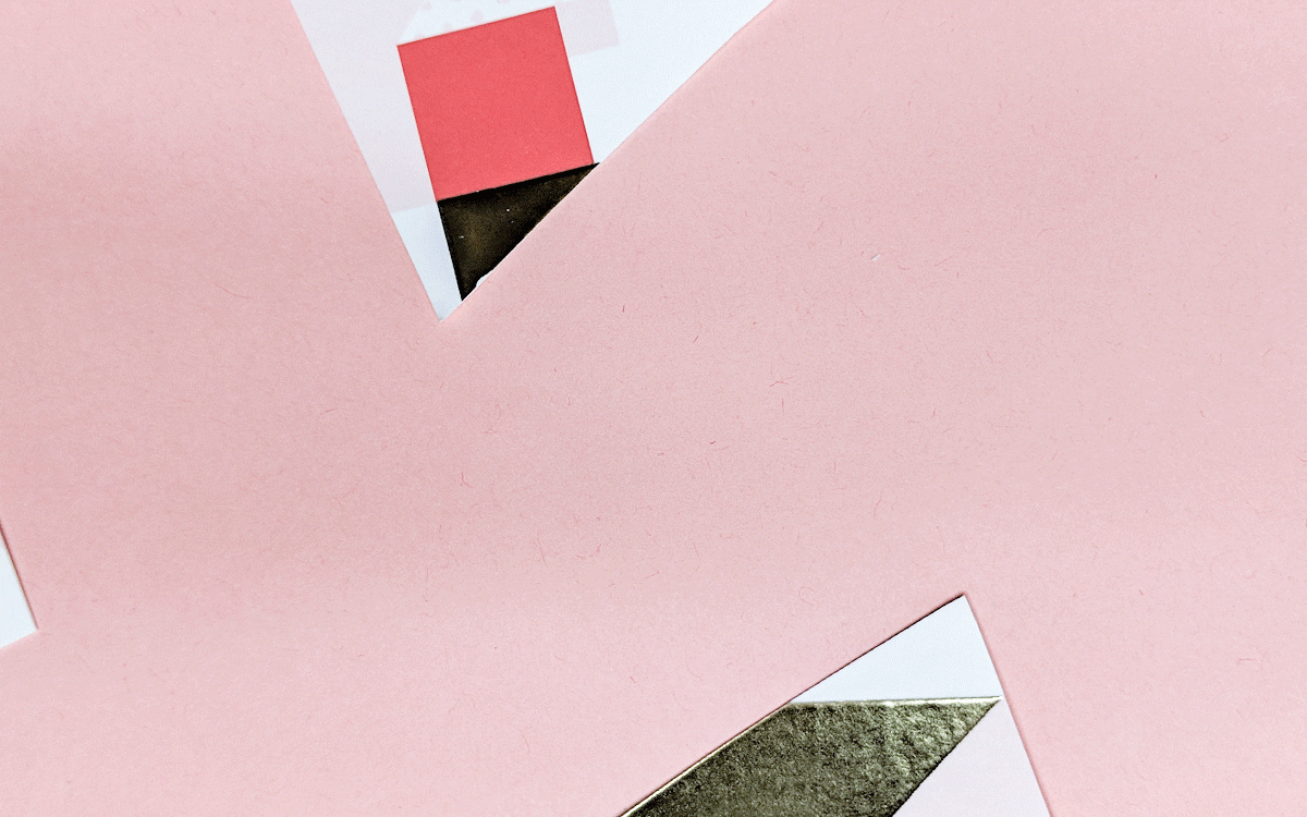
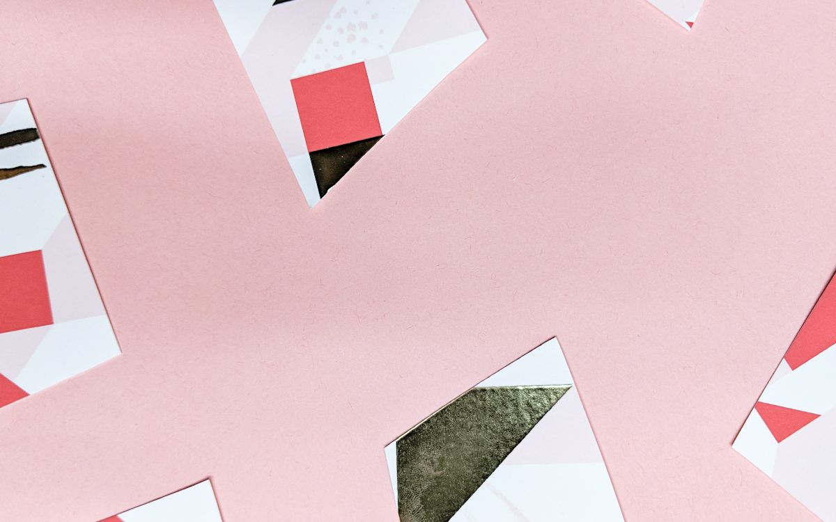
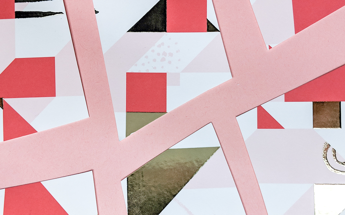
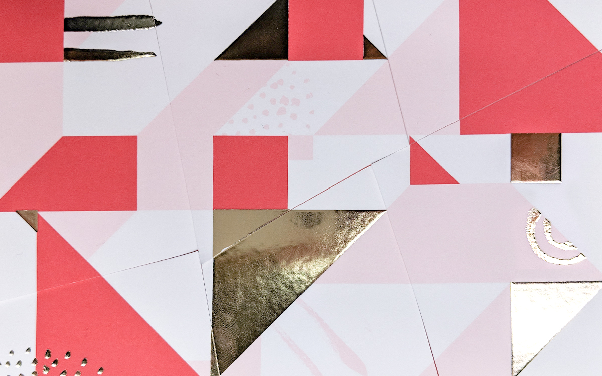
Patterns & Textures
By patterns and textures, we mean repeated visual motifs that become an element of the identity or that help evoke emotions.
For example, if a client wants rugged or earthy, we could use textures that give a distressed look. If they want luxury, we might use a marble texture to convey that products are high-quality. Or if they want a modern feel, a simple geometric pattern can help add visual depth to the identity.
These patterns and textures end up playing a subtle but important supporting role in the identity system.
Color
People are way more comfortable with color. This is unsurprising since we choose colors every day—from outfits to phone background photos.
If a client has no colors as part of an existing identity, we will choose a few options that, again, tie to their company attributes or organizational goals.
Much of the time, though, a client will have at least one or two colors that we work with. We usually end up expanding those colors because they won’t work for the web on their own—many clients just haven’t had a reason to expand their existing palettes in this way. Color variation adds depth to a site, so we make sure to use a variety of colors from lighter tones to mid-tones and deeper shades.
We also tie back to some basic tenets of color theory. If a client wants a welcoming feel, we select lighter, brighter colors. If they want to radiate luxury, we suggest neutral tones. Or if they want to convey a healthy, natural vibe we go with earth tones.
Audience Needs
All of the above should feel authentic to the organization. But we also need to make considerations for the audience. To start, we always try to keep in mind users with disabilities—employing easily readable typography and colors that offer good contrast.
Other considerations might include more nuance. Like if a client sells products for toddlers, product attributes might be playful and kid-friendly…but their actual buyer is the parent, so the design needs to be attractive to them as well.
Secret of Life
Hopefully, this gives you a taste of the secret tricks that go into creating a visual system. When we work with you, please know that all of this work is a thoughtful investment. Take the time to think seriously about your organization’s image and how you want to convey it. When you’re ready to start your own refresh, please get a hold of us. In the meantime, check out the design services on our website.