Calculating ROI for User Experience Efforts
While rounding the last lap of my 20s, I’ve realized that nothing can provide tangible value quite like cold, hard numbers. Food scales, retirement contributions, screen time, and cholesterol levels all provide me with important tidbits of information that I can then use to extract insights about my own life.
“Five grams of pretzel chips have how many calories?!”
These numerical tidbits go by many titles. Some call them benchmarks, others call them data points. But they all serve the same purpose—they contextualize numerical information into a relevant and digestible framework. Doctors use blood pressure numbers to identify trends in our overall health over time, and I use my daily phone screen time to understand how I am spending my time.
These are simple examples—instances where one quantitative input has a corresponding qualitative value and it’s easy to understand the relationship between the two. But it’s not always that straightforward.
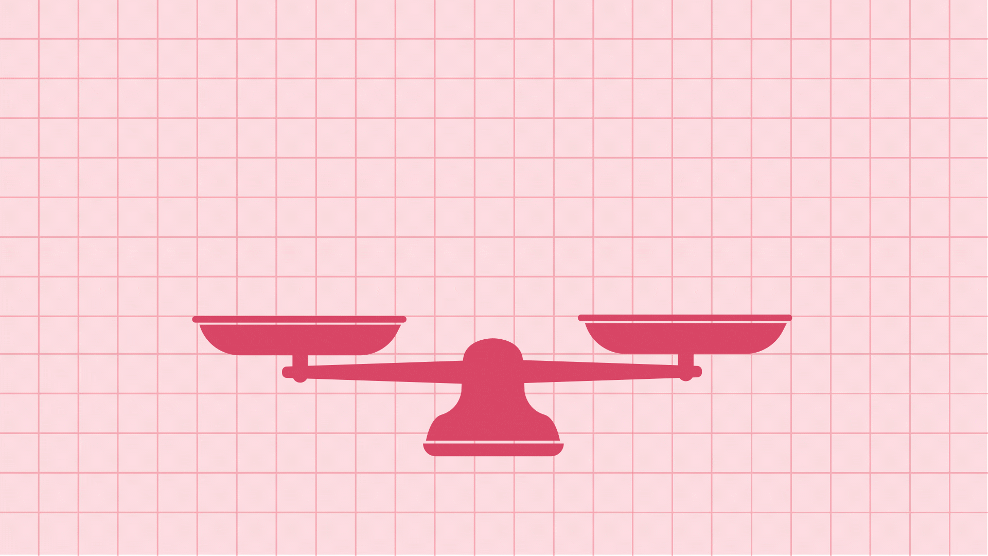
As builders of web products, Happy Medium always tries to emphasize how the work we do helps our clients and their users, but user experience (UX) professionals especially have struggled with proving their value to business decision-makers. Many people would agree that having a website that is easy to navigate and accessible to users of all abilities is an objectively good thing, but the harsh reality is that “objectively good” doesn’t always cut it with business leaders without some numbers to back it up.
Rather than trying to convince decision-makers to see things our way, I think we should meet them in the middle. Decision-makers want to be able to quantify the return on their financial, marketing, and operations investments, so we should be able to show them the impact that good UX has on their bottom line.
R-O-Why?
“But qualitative data are first-person assessments! You can’t argue with how a participant feels!” —Outraged UX Designers
It’s true. In the UX world, we often see qualitative data like moderated testing, user interviews, and diary studies as more important and insightful than quantitative data. Qualitative data lets us understand how users think and feel about a product, which allows us to adjust the product based on direct feedback from users.
A user review that says “this new website is so much easier to use!” is a huge win for us UX professionals, but it doesn’t carry the same weight for business decision-makers. On the flip side, you could show decision-makers evidence of people saying the UX of a product is terrible, but unless the quantitative data shows negative impacts on the “bottom line,” there’s no incentive to make any changes.
I know. That term is overused and cringeworthy—but this is the field we have to play in, so that is what we need to deliver.
Getting your stakeholders on board with allocating more budget toward UX efforts can be difficult. You need to hand over results that speak to the bottom-line ROI. That may sound obvious, but any UX professional who has ever tried to explain their own job knows how difficult it can be, let alone the difficulty in trying to get someone to pay you more money for your efforts.
Creating Conversions
User experience design is focused on creating easy and logical experiences for users online. And when people feel comfortable and in control of the web page they’re on, they tend to stick around longer. On the other hand, if a user visits a website and finds the experience to be frustrating, they will quickly leave the site and find another website to fulfill their needs.
That idea should be intuitive for everyone, even newcomers to web design and UX topics. But when you apply that line of thinking to e-commerce sites or other businesses that rely on their websites to build revenue, then you start to reveal one of the ways UX can build on ROI.
To put it simply, websites that are easy to navigate also make it easier for users to spend money, while difficult websites can literally frustrate a user out of using the site to purchase goods or services.
Time Is Money
Another huge cost associated with poor UX is that customers have to ask for help more often. This means that businesses have to spend more resources helping them. Good UX should predict where users will need the most support and provide them with the nurturing necessary to guide the user to their goal.
Bad UX or (gasp!) no UX confuses users and makes them give up, which can cost a company money, or users will require customer service, which also costs money. Good UX eliminates both outcomes.
In many ways, it’s easier to illustrate the expense of bad UX rather than trying to prove the value of good UX. It’s not possible to come up with a simple equation that encompasses all the ways UX designers can create greater ROI, but some work from fellow UX pros does a good job at providing us concrete evidence of UX in action.
Warning: Math Ahead
Many of the brightest minds in user experience have taken on the challenge of quantifying the impact of good UX. A study conducted in 2005 by the Institute of Electrical and Electronics Engineers (IEEE), a research organization that specializes in computer science, looked into the most common causes for failure of software development projects. The study reached two main conclusions:
- Developers spend 50% of their time fixing bugs and broken software.
- Standard UX efforts can mitigate 25% of those bugs and lost time.
Any business leaders reading this should already start to feel some gears turning. The thought of an employee using half of their time to fix preventable errors is enough to keep any decision-maker up at night.
Before you start thinking that this is just one UX designer trying to convince the world that my job is important, take into account that a recent analysis of six major tech companies reveals that more companies are increasing their ratio of designers to developers on staff. In 2012, IBM had 1 designer for every 72 developers they employed. Just five years later in 2017, that ratio changed to 1 designer to every 8 developers.
Clearly the work of designers is becoming more vital to the operations of the biggest tech giants, but let’s look into why hiring more designers makes financial sense with the help of some math from UX News Magazine editor Doug Collins.
The Equation of Money Saved
Collins came up with this formula to describe the ROI of hiring a user experience designer. This equation is based on two assumptions:
- One UX designer cuts down on necessary development hours by 50% (based off of the study from IEEE.
- A company has a designer to developer ratio of 1:6 (based off industry averages).
If you want to read the full methodology behind this equation, read the article linked above, but for now, we’ll just focus on the end results. Collins breaks the formula down like this:
[.25 * (D)(AHP)(H/2)(AWW)] / [(D/UX)/6]
Where:
D = Number of Developers
AHP = Average Hourly Pay per Developer
H = Average Dev Hours Worked (divided in half based on assumption #1 above)
AWW = Average Weeks Worked per Developer
UX = Number of UX professionals
Let’s look at an example of this formula at work. Suppose there are 39 developers at the fictional Whydea Software company and there are 6 corresponding UX professionals. Let’s say one developer makes $100,000/year, which equates to roughly $43/hour. They work an average of 40 hours a week and an average of 49 weeks per year. Take a look at how the numbers break down.
[.25 * ((39)(43)(20*)(49))] / [(39/6)/6] = $379,376.00 saved
*Note: H is divided by 2 because of assumption number 1
The formula reveals that the UX designers at Whydea Software saved the company nearly $400,000 in developer salaries by eliminating a lot of dev hours usually spent backtracking and fixing preventable errors. How’s that for ROI?
The Bottom Line
As UX designers, we like to think our work is intrinsically noble and valuable. Who could say no to a digital product that is easy to use and accessible? But as terms like “user experience” and “design thinking” expand into the business vernacular, it seems like we’ll be spending increasingly more time explaining to clients and business decision-makers that the work we do has tangible value, especially when it comes to the bottom line.
If you need more convincing, check out our case studies to see how our UX team has helped our own clients. Or, if you have a website or app that needs its own facelift, we’d love to help you out.