Recently, I was at an apartment pool with a small group of friends, when one of them admitted that she committed a cardinal, digital sin. She accidentally clicked on a political ad. To make matters worse, it was an ad for the party that we, and herself, are against.
You could hear us groan from blocks away.
We immediately had a handful of follow-ups:
Whose computer were you on?
Was it on social media?
What browser were you using?
How did it happen?
The story goes…she was watching YouTube on her personal iPad when an ad popped up for a candidate’s re-election site that covered a portion of what she was watching. When she tried to tap the X to close out, she realized, too late, that the X was actually a part of the image and not an actual link—a deliberate trick. A familiar storm of dread and despair washed over her.
She has since been exposed to one piece of direct mail marketing, two to three social media ads, no fewer than one banner ad on YouTube per day, and display ads all over the websites she frequents.
A “dark pattern” is the intentional misuse of digital elements to force a user into performing a certain action. I realize that this sounds like a page right out of Star Wars, but as we’ve seen from the Cambridge Analytica scandal, dark-side data practices can carry some strong influence.
No UX textbook or credible UX professional will promote using dark patterns, so why do we keep seeing them? The unfortunate truth is that dark patterns can be effective in producing short-term results, but what you risk is user trust and brand credibility. In the long term, users will eventually make the switch to more ethical products and services.
Nevertheless, politics, an arena well- versed in achieving short- term gains at the expense of long-term benefits, still willingly employs dark patterns. So as long as these patterns still appear, the best we can do is educate ourselves and be aware of how both sides of the aisle employ bad-faith UX to their own benefit.
Quick Review: UI Patterns vs. UX Patterns
User Interface Patterns are a piece or a section of a website (or software) that users interact with. These sections have common elements like text, colors, icons, graphics, and buttons. These are considered hard assets, e.g., you could buy three patterns from a designer if you wanted to.
User Experience Patterns are a collection of interactions a user has with the multiple interfaces, people, or culture of a company. For example, when you buy yourself a pair of Nikes online, you interact with many different UIs, on top of shipping times, and customer support (if need be).
What to Look For (From Both Sides of the Aisle)
Deliberate Misdirection (UI)
You may have seen this on retail websites where the more expensive option of a very similar item is highlighted. This is used to divert your focus. One political candidate has their $500 button do an animated “jiggle” (cringe) on their online donation form with a label that says “Join the President’s Club.” The whole time, the $100 donation button is already selected in a dark blue. Keep in mind there are two other donation amounts to choose from that are lower than $100.
These digital ads are designed to intentionally distract users and make decisions for them instead of letting users decide on their own. As Qui-Gon Jin once said, “Your focus determines your reality.” Try to be aware of where political ads divert your intention.
Forced Continuity (UX)
Individual donations are not only important to fund a political campaign, they also serve as a metric for how much momentum a campaign carries into election day. The importance of these donations incentivizes campaigns to engage in some tricky UX to keep them rolling in.
Another type of dark UX pattern that’s pervasive in political campaigns is forced continuity. Forced continuity works by automatically opting users into unintended repeated actions after they take a single, intentional action.
If you’ve ever subscribed to something and swore up and down that there was no mention of payments recurring, you’ve been a victim of forced continuity. When donating to a political cause, it’s common for the campaign to make donations recurring by default while obscuring the ways to opt-out of recurring donations.
Growth Hacking via Spamming (UX)
Remember the example at the beginning? My friend clicked the ad, and now her social networks are being exposed to political ads. If you ever like, subscribe, or react to something on the internet—by accident or not—your friends will probably see that you’ve interacted with it and you may receive a bombardment of retargeted ads.
This is an instance where UX and marketing clash. A marketer will correctly say that repetition is an effective strategy to increase conversions, while a UX designer will also correctly say that excessive repetition over time will result in a negative view of the advertiser.
Just another example of prioritizing short-term gain over long-term results.
Accessibility Nonobservance & Abuse (UI)
The companies in charge of designing political donation forms, websites, and ads know all too well that senior citizens love to vote—and they’re not just getting their information from CSPAN anymore.
The rate of older adults using technology is climbing. And even though television advertising still dominates political spending, the amount spent on digital ads in the 2020 election is expected to top $1 billion—three times the total of the 2016 presidential election.
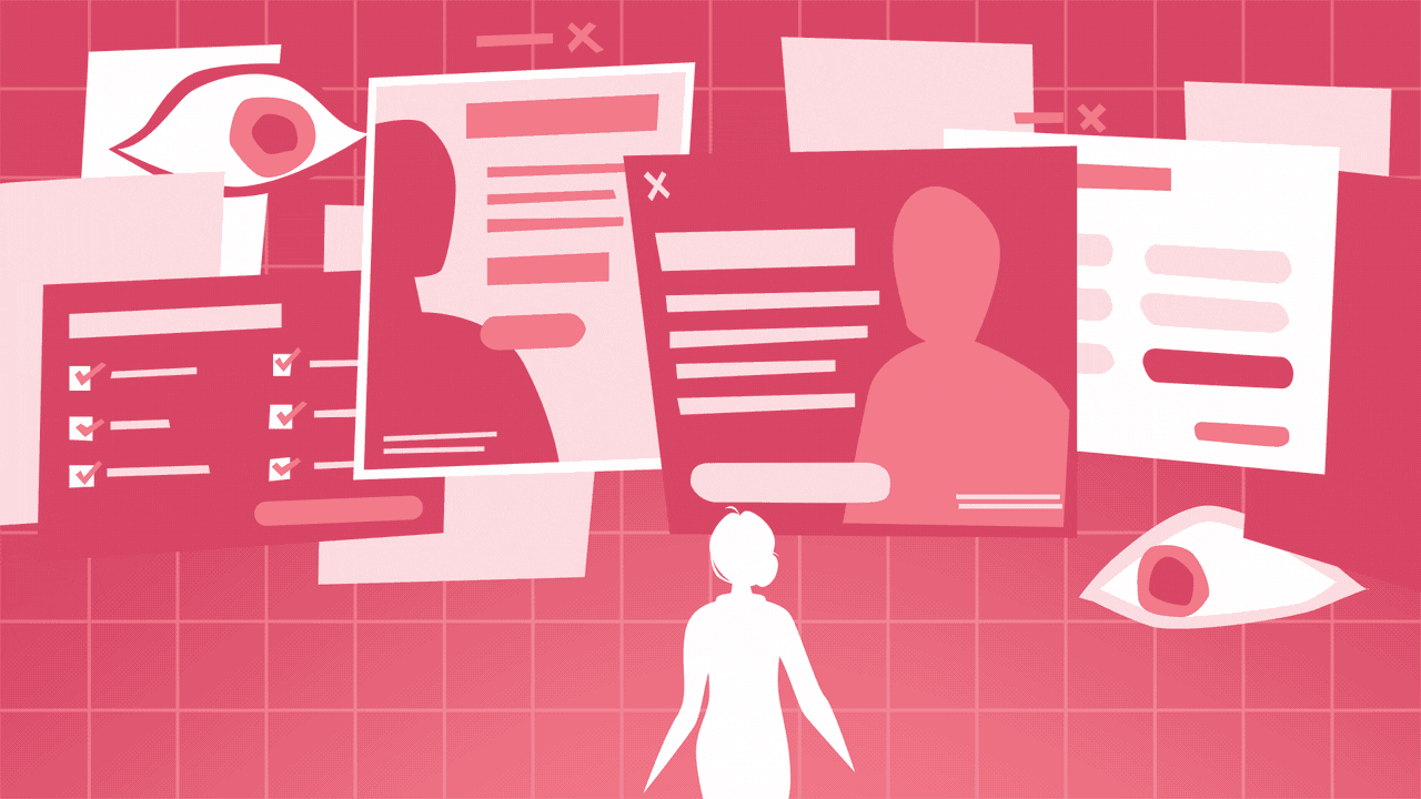
This means that older adults are more likely to find political information online than ever before, which makes it even more important to design ads and websites that are accessible to all users. When designers unwittingly make an ad or website inaccessible to all users it’s called accessibility nonobservance, and when they do it intentionally to hide information from certain audiences, it’s called accessibility abuse.
Accessibility abuse is one of the most insidious tactics that bad-faith UX designers use. It can include anything from making important text super small and difficult to read to omitting alt-text on images. The result is unequal access to information for all users, and that is something all UX or UI designers should frown upon.
Roach Motel (UX)
Named for a brand of cockroach trap, a roach motel in UX refers to any decision that is easy for a user to make but difficult to reverse (i.e. it’s easy easy to enter the trap, but difficult to leave).
Most people have encountered a roach motel through email subscriptions. You may buy a product online and be opted into receiving regular emails from the company. In this example, entering your email to buy the product is analogous to a cockroach being coaxed into the trap with bait. Once in the trap, the roach motel takes shape by making it difficult for the user to unsubscribe from the emails.
The roach motel has a lot in common with forced continuity, but forced continuity usually refers only to recurring payments or free subscriptions that turn into paid subscriptions without the user’s permission. The roach motel tends to appear mostly in email, direct mail, and phone calls.
The Expanding Basket (UX/UI)
The expanding basket occurs whenever you need to uncheck a selection to avoid paying for it. Airline websites are notorious for adding baggage insurance and other sneaky fees that slide under the radar. These are often hidden within something we call “accordions,” an element that expands upon clicking or tapping.
When it comes to political websites, this may appear in the form of an already checked box on donation forms. One example I saw on a donation form was an already checked box saying, “Defend Mitch McConnell’s Money Bomb,” but when you take a closer look, it states in smaller font, “Donate an additional $___ automatically on 9/30.”
This tactic is manipulative because it automatically opts users into an additional option and requires them to take action to opt-out. Opting a user into spending more money without their permission is not only bad UX, it’s bad business, too.
White Hat UX
White hat UX, a term borrowed from the heydays of SEO (and also the title of a great UX book), has now become a digital way of life.
The term refers to a commitment from UX and UI designers to abandon dark-side tactics. The internet has long been a place where sneaky designers can trick users into taking actions that are against their best interests. White hat designers recognize the harm these tricks can do and advocate for an approach that puts users in control.
White hat UX and UI designers are much more valuable than designers that use these dark patterns. Regardless of the results that a dark-side approach can achieve, all UX and UI designers should share the burden of maintaining the integrity of our field.
We’re in an age where most everyone understands that there was a designer behind something digital. So if you’re really stuck between any political candidate in the future, take a look at their websites, ads, and social content and look for dark UX/UI patterns. You may end up learning more about the candidate from how their ads are designed than what they actually say.
To all you Lukes and Leias who are starting to design, just remember that, “Once you start down the dark path, forever will it dominate your destiny.” And for any businesses trying to leave the dark side, Happy Medium is happy to help.
Sources
Dark Patterns, by Krisztina Szerovay
Falbe, Trine, et al. White Hat UX: The Next Generation in User Experience. 2017.