This month we’re excited to feature a longtime client, Gardiner + Co. Recently we completed the second iteration of their website — we completed the first in December 2014. This time around we also helped them develop an updated brand.
The rebrand was a portion of their ongoing business strategy, a way to show that the company is growing to meet new demands while maintaining its core identity as a client-focused organization.
The Rebranding Strategy
First up was an updated company name, Gardiner + Company. The name recognizes that it’s the value-added work, or the pluses, that make them important partners for their clients. The plus sign is also a playful nod their line of work — accounting.
Perhaps the most prominent feature of the new Gardiner +Co. brand is their G logo. The continuous line represents how the company has spent the past 50 years developing deep relationships with clients. It shows that Gardiner + Co. will always be there for its clients, using expertise to create a prosperous future.
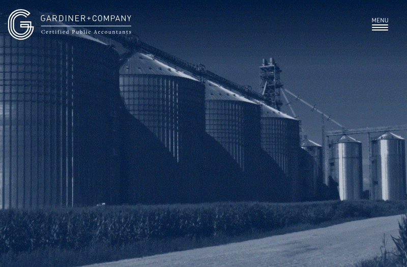
Lastly, the rebrand features new colors that provide a bold and energized touch that still feels professional and sophisticated. The logo uses orange, a color not often seen in the accounting industry, setting them apart and showcasing our forward-thinking attitude.
“Rebranding our long-term client Gardiner + Company was an exciting project, as we’ve seen them evolve and grow over the years. I loved creating a custom letterform logo for them and helping them determine what they want their future to look like. It’s always exciting to help rework all different elements of a rebrand: from the logo and website to their printed materials.”
– Sarah Fisch, Visual Designer